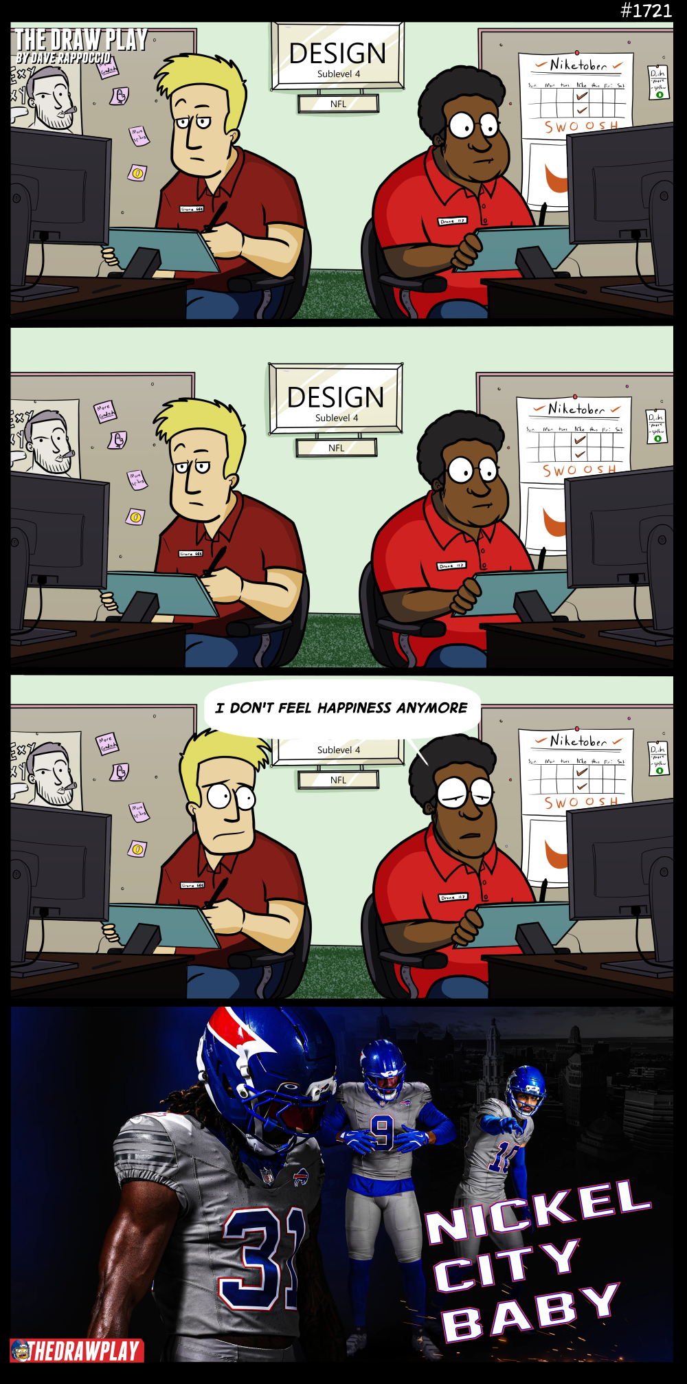

The Bills Concrete Turd
When I do these Uniform critiques, I like to bring up both the positives and negatives of each. None of these uniforms, even the horrible Rams Bone bullshit, are without something that works for me. So in the interest of fairness, I’ll start with what I like about the Bills new alternate “Nickel City” uniform.
I like that the helmet is not just the logo. I’ve have always personally loved when teams do something interesting with their helmet. The Eagles wings, the Rams horn, the Vikings horn, the Bengals stripes. All of these are the best helmets in the league for a reason, because they use the helmet as a canvas for an identity rather than a place to slap an icon. There are many teams that I have always felt had the opportunity to be creative with their helmet, and the Bills Horn Stripe…thing has always been near the top of that list. I am happy to see it realized on this new alternate.
Everything else about this is butt ass.
You know how shit a uniform has to be to make me wish it was a black alternate instead? I hate the alt black uniforms because they all look the same and often lack real creativity to them. They often feel lazy, like the team just decided that all they needed to be Batman was the color of his cape. But there is one thing I will give black alternates: every color works with black. It is an aesthetically perfect color that pairs with everything else. Probably because in terms of color, black is all colors (not in regards to light, where black is the absence of color). All the black alternates have defenders because in a vacuum, black alternates simply work every time. You slap the team’s usual colors on a black canvas and it always looks at least okay.
White works the same way, being the absence of color, it naturally pairs well with every color. That’s why away uniforms are always based around a white template, and why “White Out” uniforms have been popular alternates as of late.
What does not work with everything is grey. Grey has depth. It is not on the extreme ends of the spectrum; it sits in the middle. But grey does not have a hue. When you drag a picture into an image editor and remove the saturation, you get greys. Greys of many values, creating contrasts and such, but just greys. While grey is neutral, it still requires more work to properly pair with the normal gamut of colors. This is why I tend to find grey alternates to be the ugliest of them all.
The Seahawks wolf grey just looked dirty or wet. The Lions grey had a better tone to it, but it still made everyone look like a concrete slab. Both picked better blues to pair with the grey than the Bills. The Bills standard blue is very saturated and strong, same with the red, and as a result the helmet and the jersey just clash. It looks too blue. The Seahawks blue is more muted and dark, with the bright green adding the necessary pop. The Lions blue is lighter and works better with the grey. This Bills blue/grey is just awful.
I will say, these are promo pictures, they may work better on the field, something that must be noted with all of these uniforms. I think they’ll still be shit though.
But remove the color discussion from the equation entirely and I’ll give you the main reason it sucks: it doesn’t look like the Bills. The Seahawks and Lions greys work better because both the Hawks and Lions use those greys as part of their normal color scheme. The Bills color scheme is a very saturated Red, White, and Blue. Grey is not part of the equation. This is often why I have issues with black alternates but not with black uniforms for teams like the Steelers, Panthers, or Raiders. A team’s uniform should still feel like the team is represented. Grey is not Buffalo. The grey they use doesn’t even look like the grey you’d see with a nickel. To be honest, a grey helmet with a grey buffalo on it feels like it would actually match the “theme” they’ve chosen far better than this crap. Nickels are shiny coins, making a shiny grey coin-inspired helmet feels like the real missed opportunity here.
When Buffalo did the color rush reds, they still looked like the Bills, just dumber. When they did the rivalry white out uniforms, they looked bad, but at least white and snow is a Buffalo thing and they tinted the blues to better match with the theme. How many people associate Buffalo with nickels? When I heard the name I had to go look up the history. This uniform just looks like Boise State, and not the good Boise State look.
It’s ass. This is simultaneously boring, ugly, too bright, too drab, too different, too niche-inspired yet too generic all at the same time. I have seen very few people defend them. Sometimes an idea is just a fat log of a turd falling out of your ass and thumping to the side of the bowl so it leaves a stain and smells horrible. I can’t even say nice try.
If this is what the Joe Brady era represents, then I am more convinced than ever this team has begun their descent back into the bowl.

That’s a really smart approach – it’s easy to just focus on what’s bad, but finding something worthwhile is always interesting.
I can’t wait to see these uniforms on the turf against the Orlando Predators…
My partner and I looked at these and immediately thought of a can of Pepsi.
The only thing this brings to mind is the deeply buried horror that was Pepsi-Man.
They look like they’re branded by Pepsi, cuz every time I look at this uniform, all I can see is Pepsi Man.
Like the Bills, things never goes right for him.
Pepsi for TV-Game.
Same, Nike artist. Same.
Nickers made everyone depressed.
-Babe it’s time for your gray alternate jersey
-Red helmet pls
“Probably because in terms of color, black is all colors (not in regards to light, where black is the absence of color)”
this gets really complicated; but that statement in terms of tint, or ink, or pigment, is incorrect.
I am an industrial painter by trade and an art-painter-guy by calling.
blacks in printing or painting or any other useful thing I can think of are NOT comprised of “all colors”. that would be wasteful, expensive, inconsistent, and dreadfully complicated.
a “pure black” in print/paint/physical media is usually some form of carbon black.**
most blacks are “off-blacks”, which is to say mostly carbon black, but with tiny amounts of other colors (usually reds and oranges) added to them. sometimes i need only a small amount of paint, but the limitations on the sensitivity of the scale and the human error mean that instead of making 100ml, I have to make a full liter, because it requires 3ml of red, and the system doesn’t trust me to accurately handle lesser amounts.
**interestingly, the seemingly light-sucking “vanta black” is carbon, but, like, “fluffy carbon”, meaning it has greater molecular-level surface area, hence a deeper black, but doesn’t stay that way because the surface attracts and then retains dust.
These would have gone so hard if the horn and trailing red stripe on the helmet were way larger. Think Eagles wing or Rams horn upscaled. Just huge. Also, I think a bold “B” in team font on the left breast of the jersey instead of the buffalo logo would have been an interesting change. It’d be left up to interpretation whether the “B” stood for Buffalo or Bills or both. It’s fluid.
By the way. Albert Regis says no more tush push for you Buffalo.
Do they also work for EA’s Madden Team Rating department, because yeah, this feels like they do. The Jags, the 3rd best team in the AFC last year, is ranked 28th? The Raiders, the team that won 3 total games last year is 25th? And the Giants at 24th? What the heck? Who knew writing numbers this badly was a possibility.