
The Rams New Uniforms Are Monkey Shit
If you’d like a calm, reasonable breakdown on why the Rams new uniforms are bad, I would direct you to the best authority on the subject: Uniwatch. They always have a good breakdown, and if you don’t like curse words and extreme impotent internet fury, I suggest you read that instead of what is coming down below.

They say if you can’t say something nice then don’t say anything at all. Okay. In the interest of fairness, I’ll state the things I’m okay with in the Rams new uniform. I think the helmet looks pretty decent. I like the sharp bright colors on the shiny helmet. The segmented Rams horn is not as good as the solid horn with the deeper curl, but the colors seem fine to me and it looks alright. On a better uniform, these might be worth complaining about. On this uniform, they are the highlight!
Okay fuck that these dumpsters can eat my shit.
When the Falcons uniform came out, I found myself opposing the common opinion and saying they looked alright. I called for more modern uniform elements and I frequently will go to bat for the more outlandish and weird decisions Nike/the teams make. I proudly stand against most fans who instinctively hate change and don’t want anything new or interesting. Those “classic” looks weren’t always classic. You have to switch things up and try new ideas to create what might become a new classic. Many of these ideas will age poorly. Some we will never know how we lived without. I want new ideas and I will support these weird concepts even if I don’t like them. So after that, with these dingleberrys sitting in front of me like a tv dinner made of dead birds and cow pies, I feel immense regret and shame for wanting this.
I like gradients and don’t want to hate on them! But then I get this! Look at those numbers and tell me they wouldn’t look better as solid yellow or even solid white. The numbers also have a faint reflective design to them that you can’t see unless you zoom in. I love design elements I can’t see from proper social distancing measures. The font isn’t awful and the reflective streaks aren’t noticeable. The gradient sucks ass harder than my freshly cleaned vacuum slurping up dog hair in the hallway.
Why do they have tags on the collar? You know what, they are small, they show the dumb new logo but okay. It’s stupid, but okay. Fine. Overall, the blue home look (especially with the yellow pants) isn’t a flaming pile of dead flamingos. Maybe…that’s because they are just a poor man’s version of the far superior Chargers alt jersey. The Chargers uniform is just better. The colors are better. The font is better. The only thing on the Rams version that is better is the helmet, which was already one of the best in the league and still suffered a downgrade... Great fucking job making the two LA teams pretty much have the same look. The team no one watches gets the better uniform. The team paying Jared Goff a billion dollars gets a 12 year old’s “create a uniform” in Madden.
But the real issue with this new look? It isn’t the home uniform combos. If it was, this would just be another below average revamp that will get fixed in a few years like the Bucs. The real corn in this proverbial squishy ass blast is the away uniform.

It is like they had every idea in the world, then removed all the good ones, threw the rest on a pile, peed on it, then set it on fire, then went on lunch break, and all of this took place in Gary Indiana. It takes a lot to make me want to not cheat at these comics. These comics are my favorite because I can just steal the same 3 panels, change the text a bit, and make one easy panel, and everyone looks forward to it. This away uniform is such trash that not only did I redraw the entire background for modern HD, I even took away the two heroes to replace them with a monkey with visible testicles throwing shit at a screen because even my delightful bumbling designers are better than this.
What the fuck? What the fuck is all of (gestures at everything)?
Bone! Not white, but BONE. Why? Because Rams horns are bones, so let’s use the color of BONE. On the helmet horns? No. On any visible horns on the uniform? No. BONE. You want to make your away jersey look slightly dirty? Fine. Bone could work. Against a green field at a broadcast distance, it probably won’t be all that offensive. But then…WHY HAVE GENUINE PATCHES AND STRIPES OF REAL WHITE ON THE SAME UNIFORM? WHY BOTHER HAVING WHITE STRIPES ON YOUR SLIGHTLY LESS WHITE PANTS?

ALL THAT DOES IS DRAW ATTENTION TO THE FACT THAT THE UNIFORMS AREN’T ALL WHITE. STICK A BLUE STRIPE OR OUTLINE ON THE OUTSIDE OF THE WHITE STRIPE AND IT MIGHT WORK AND ALSO ADD MUCH NEEDED CONTRAST. Okay. Okay. Let me settle down a bit.
WHY DOES THE AWAY UNIFORM HAVE SHOULDER NUMBERS BUT THE HOME UNIFORM DOESN’T? PICK A SIDE. I don’t like shoulder numbers. I never draw them in the comics because they feel redundant. The lack of them on the home jersey makes it better. The presence of them on the away jerseys feels inconsistent with the home, but it isn’t awful. Know what is awful? instead of using a horn on the shoulder like the home jersey, they use a super thin yellow stripe that I will henceforth call the pee stream running under the numbers. Why? Who the fuck knows.
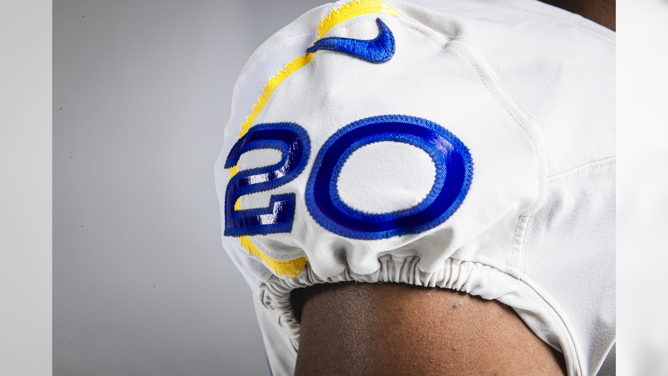
WHY DOES IT GO UNDER THE NUMBERS? WHY IS IT SO SKINNY AND THIN? IT LOOKS LIKE A STREAM OF PEE. You want to know the stupidest part? You won’t be able to see it on TV, because yellow and white are two colors that do not feature enough contrast between them (especially not the bright yellow they are using here). Out of every primary and secondary color, yellow is by far the closest in tone to white. Without a third, darker color in there to offer some visual contrast, the two of them blend together very easily. This could be helped by a proper balance between the two colors. What does this uniform do? No balance. The urine stream of yellow running down the shoulder is a centimeter wide, meaning that you won’t even see it at a distance. Meaning…what is the fucking point? If you want shoulder decals to stand out, they have to be visible on TV! This won’t be! It’ll look slightly off, like yellow snow, if you can even notice it. Why not just make the yellow be an outline over the blue numbers? Why not make blue horns around the shoulder? WHY A PEE STREAM UNDER THE NUMBERS?
But as laughably bad as the pee stream is, it still isn’t the thing I hate the most. That would be the nametag patch.

HELLO MY NAME IS RAMS
The blue one, outside the yellow thread (WE’LL GET TO THAT) isn’t that bad. Some people have theorized that it is a placeholder for advertisements. Maybe the Rams method is to make a tag so stupid that a Verizon logo would be an improvement. The Rams already blew it throwing their logo on a stupid collar tag, so now they have to put words instead. RAMS works. LOS ANGELES RAMS? Too many words. Especially when it is on a PURE WHITE tag on top of a BONE jersey, making the tag stand out more. For no reason. To make the BONE jersey look dirtier I guess.
But then the thread on the top right side. I’m just going to quote Uniwatch on this hilarious thought process.
I asked the team about the yellow zigzag stitching along the top edge of both patches and was told the following: “This is a unique design feature that we are excited to introduce. This stitching above the patch is the same stitch used throughout our jerseys — it’s a feature we could potentially use across other merchandise going forward.” An article posted yesterday on The Athletic (paywalled) added this: “The zig-zagging ‘signature stitch’ was inspired by some fashion designers’ iconic ‘mark’ on the clothing they create.” Oooookay.
The Rams new signature style element is making it look like they fucked up the patch and had to sew it back on using the wrong color thread.
Seriously. Their signature style element looks like what happens if my dog rips a part of my clothes and when I go to fix it, I only had the wrong thread color. You don’t want a signature design element that looks like the uniform equivalent of a person who fixed their broken car headlight by duct taping over the hole. You can’t even put the yellow thread pattern around the whole patch? Then it would at least have symmetry and look purposeful, instead of like you were bored and fiddling with your uniform until you accidentally started ripping off the decal and panic fixed it. There is nothing the team can say that makes this element look like anything but a fuckup. The only saving grace is how small and minor it is, so you won’t see it on TV. Probably. The blue jersey makes it pretty visible.
These are far and away my pick for the worst away uniforms in the league. I’m torn on if I want to lump the home jerseys that low too, and overall they might be my least favorite look, but the helmet is still slick enough to save it. What amazes me about the away uniform is not only is it full of bold and terrible new choices, but they still coagulate into a surprisingly boring whole. Everything garbage about the away uniforms is subtle to the point where at a distance, they are just dull off-white. They look dull and bad from afar, they look ghastly stupid up close. It’s rare to pull off the double fashion kill, but they did it. Bravo, Rams. You fucked it up. You threw poop at the fan and called it a day.
I’ve defended Nike’s choices before, and I’ll probably defend them after this. But these are the uniform equivalent of Todd Gurley’s knee.
I can’t wait till we get the good uniforms back in 3 years.

My god, Dave…you got RANTY tonight!
Me likey!
The outline of the numbers is too understated. I like fonts that do stuff like this – Bron, Core Escher, Epilepsja, the new MLS font and stuff – but this is barely noticeable. And the shoulder numbers look dumb in a different style like that. And if you’re going to make something reflective, go big or go home. I liked that aspect of Tampa’s alarm-clock numbering.
And gradients are cool, they’ve been a mainstay of my graphic work, but I at least try to switch things up a bit with light gaussian noise, some Difference Clouds and a motion blur.
Dave has already touched on my issues with these uniforms, and I don’t usually post on uniform reveals because I don’t care enough, but these ones are so ridiculous that I can’t help myself, so ****, whatever, let’s post.
Not gonna lie, that gradient on the number is hideous. I, too, like gradients, probably more than the average guy(I thought the Jags’ old helmets with their gold-black gradients(TDP issue #95) were awesome). But this… No! Nonononono! You simply don’t mix bright yellow with white! What the hell, Rams?
You know what they reminded me of when I first saw them? I imagined them being pure white at first, only for someone to take a piss on the top and the result slowly soaking downwards. I’m sorry, but that’s really what it reminds me of. They’re literally pissing their pa… I mean, their shirts, whatever.
Also, that gray away uniform. Dave called it BONE, but I’m not a sharp eye regarding color, so screw it, let’s call it gray. It’s immediately noticeable that it’s not white, but the kind of dirty-snow color covered with grit. You know what that reminds me of? The Seahawks alt uniforms. The one that isn’t laughable neon green(incidentally, the neon green is so lousy it’s AMAZING, but whatever). As much as I don’t like it, the gray look is so strikingly unique that I immediately connect it to them. I’m sorry, Rams, but are you actually plagiarizing your division rival’s uniform color? Seriously?
The name tag is ridiculous and not worth ranting about. It might probably be just a placeholder for, as Dave insinuated, an advertisement and won’t exist on the final product come game day. I dearly hope it won’t because that’s simply inexcusable.
Look, I understand that I’m not an artistic guy. I’m bad at aesthetics. I’m a guy who would regularly get into an arguing match with the art teacher back in middle/high school, get my work publicly insulted in class and get a D minus slapped on it. I don’t usually judge what looks good and what doesn’t. I accept that I’m not qualified for that.
Even so, these uniforms are offensively and shockingly bad. And not in the ‘so ridiculous it’s funny’ way, even. Had to get it out of my system.
PS. The helmets are cool, at least. And I don’t really mind the ‘pee stream’ as Dave called it.
I called it Bone because that is literally what the Rams are saying it is. Bone is the official color
and that font is something called cilian rail.
I’m generally not a fan of single color uniforms, but the Rams had one that not only I enjoyed, I considered it my favorite in all NFL, their color rush yellow unis. They went away with those for this ‘bone’ atrocity.
And the numbers outline remind me of something Nike did for Barcelona a few seasons ago, only they terribly messed up with the lack of contrast and that gradient.
I’m not a Rams fan, I’ve only ever been a Rams fan for one day (and they let us down then), and I generally don’t much care what a uniform looks like, but these look like they were designed by blind people
I should hate the gradient numbers but for some reason I don’t. I agree with you about everything else. I’d also like to add that, instead of going back to the white-blue-white stripes they had on their yellow pants for 30 years they decided to go with that heavy blue stripe and single thin white stripe that I’ve only ever seen before at the NFL level on Washington’s pants from 1999 until they got sick of them and changed their pants midseason without notifying the league.
I’m going to agree with you. Overall dumpster fire, and gradient numbers sounds like a bad idea. They have no reason to look as good as they do, but somehow they work.
I think what you guys are failing to appreciate is that gradients look good to you only because of how horrific everything else is. If someone offered you a dead rat sandwich while you were viewing these, you’d pause and think, “That *does* look kinda tasty right now!” X’D
Except that the gradient numbers are the worst element on the blue jersey, which actually looks decent otherwise.
Sylvester Stallone has convinced me I would enjoy a rat sandwich.
i’ve had squirrel and possum, and they were both tasty. i’d eat country rat in a city minute.
The stitching – I think – is supposed to make the patch look like a football. Except no one will notice, because it’s yellow on white.
That would work if the stitching was in the middle, like where it is with a football. But the stitch is too far to the side for that.
Footballs are strait laced. The patch is a baseball stitch.
Like when people ask me why I don’t like Wheel of Time, I’m like “Nah…it’s just going to sound like I’m insulting your intelligence eventually…let’s talk about Guy Gavriel Kay instead. What do you mean you’ve never read anything by Guy Gavriel Kay?! HOW CAN YOU SIT THERE AND TELL ME WITH A STRAIGHT FACE THAT WHEEL OF TIME IS THE BEST WHEN YOU’VE JUST RECENTLY LEARNED THAT BOOKS HAVE WORDS ON THE INSIDE?!!!”
You missed another mismatch — on the chest “ad plate”, LOS ANGELES above Rams is one line on the blue uni and two lines on the “bone” one. They can’t even decide on what their boring text alt logo is.
Scratch that.. LOS ANGELES isn’t even there on the blue one. I thought it was and was too small to read, but that was the stupid yellow zigzag.
Thank you
Those uniforms look like they belong to an amateur team.
I wonder if seeing the Rams crash and burn in various ways is painful or cathartic for St. Louis.
I’m gonna guess cathartic. At least now they don’t even look like the old Rams.
Imagine, if you will, being a famous football player and robbing a party you attended where everybody knows you and thinking you’ll get away with it.
DeAndre Baker’s only been in the league a year too so it’s not like he would have CTE yet…or would he?
He plays for the Giants. I’m only a Giants fan, and I feel like the last few years have given *ME* CTE. I can only imagine the brain trauma their own players are suffering. =/
babbys first ms paint
looks like a michigan jersey that came down with covid19
Ouch Giants first round pick.
“The Rams new signature style element is making it look like they fucked up the patch and had to sew it back on using the wrong color thread.”
To me, it looks more like “they partially undid the patch, hid something behind it, then sewed it back on with the wrong color thread.” But other than that, the critique is spot-on. That’s one good thing about the Colts: no matter how strung out Irsay gets, they don’t fuck around with the uniform much.
I… don’t hate the bone. I really don’t.
The numbers, on the other hand, are indefensible and unforgivable both in font and gradient.
From far away, I didn’t even notice all those little details that all just make things worse. Nobody is gonna notice them unless they’re standing right next to the players, so why bother?
The whole thing has been an exercise in awful. The ONLY thing they did right was the blue and yellow color.
For those who like the gradient numbers, I saw someone the other day who compared it to a urine color chart. Considering they used the gradient on two unis then the “pee stream ram horn” on the BONE (totally not white) uni, it seems as if piss was the common theme here.
My take on them is simple. The Rams, I thought, were supposed to be THE team in LA. Instead, they have high school caliber uniforms with a made for college helmet. I hate the helmet, but I do admit it’s best part. Why do I hate the helmet? Because it draws attention to their sloppy second logo they picked up off the Chargers trash pile. People crapped on it. So, they put it on their head and made it shiny. The level of inconsistency on these uniforms is off the charts stupid. That shit throwing monkey could make something better than this.
On the plus side, their horrible mistake (that will ABSOLUTELY be discarded ASAP) made for what I consider to be one of the best TDP blog rants ever. Reading this, I could feel your anger Dave. It was also hilarious because it just seemed to want to keep going. Fantastic.
I just took a better look at the patch on the BONE uniform………I have no words…
My favorite comment about the Bone unis was that their Bone on Bone color scheme was in honor of Todd Gurley’s knee.
It’s just all a mess. The blue and yellow will probably be fine during the wide view of broadcast, but the closeups show the mess of it.
The new helmets are probably the least offensive part of the uniform… but I think they are the most disappointing. The Rams horn helmet logo was the first in NFL history, dating to 1946, and had essentially continued little changed from then until now. Sad to lose that history.
The biggest question is if we don’t even have a season will we still get new uniforms next year and will Tom Brady still be playing. Will Gronk still have a WWE belt? Will Covid19 be Covid20 and will I still have a gf? I don’t know
Anyone else feel like they’re watching a gas station and not an NFL team?
Wait…
I just realized that Sexy Rexy’s expression on the poster has changed from the usual format’s cocky/dreamy one, even his poster self is perturbed/startled/confused at the hideous mess that is the Rams uniforms.
Goddammit, Rams.
I think the most offensive part of all is the font. I see the font and all I can think of is McDonald’s golden arches for some reason. It makes them look like screenprinted garbage jerseys you’d see on a middle school team or a Pop Warner league team. And even those teams might have more self-respect than to wear something as bad as these uniforms.