
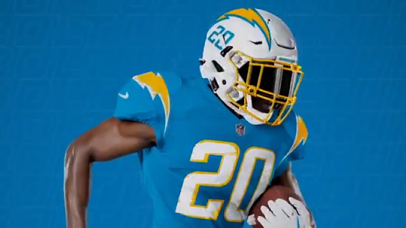
The Chargers Get Good Duds
Finally, a new, modern uniform that absolutely works. You could always count on the Chargers to get it right.
Now that the 2020 redesigns seem to have finally ended I think I’ll soon be pooling together some thoughts and ranking them at some point in the offseason for #CoronaContent but rest assured this one will probably be up there. There’s only one thing about this uniform I don’t like: the numbers on the helmets. I think it looks a little goofy. But instead of going in at length about these, I wanted to take a short moment to kind of make a call for a change.
I think the NFL and Nike need to rethink how to change how they do the helmets. I don’t think just slapping the logo on the side really works anymore, and I’ll tell you why. Modern football helmets are busy. They are complicated. Take a closer look at the helmets in the concept art. New helmets have lots of angles. They have ventilation holes. They have creases and slits. They are complicated beasts. Each of those little nooks and crannies make the look just a bit more busy. The logo decals start warping and looking funny to adjust to the new shapes. The more complicated facemasks also take up more visual room.
These adjustments make the helmet safer and more comfortable, but they complicate the cleanliness of the designs. Look at that modern helmet, with all the nooks and crannies and holes, and compare it to how clean and sleek the ultra smooth surface of a more classic helmet looks. It just looks so much cleaner from a style perspective. So we have this issue where the safer a helmet gets, the worse it looks, and the less the usual method of slapping the logo on the side doesn’t look as good because there are a bunch of angles and holes taking away from the style. Sticking the logo on the side of the helmet just doesn’t work that well anymore, especially on white or lighter helmets. I’ve always disliked white helmets compared to colored ones and I think I’ve finally put my finger on one of the reasons why. Darker colors can hide the holes better, but it still isn’t perfect.
I am calling for the NFL to get more creative on how they design their helmets. The best helmets are the ones that already go above the standard of just slapping a logo on the side and use the helmet in a more interesting way: The Eagles, The Vikings, Rams, and Bengals are prime examples of using the helmet as a template for something more interesting. The Browns are also a great case for a more minimalist look, as their helmets look fantastic with nothing slapped on them but a center stripe. Both of these approaches work better with modern helmets. The Steelers also look great, because the black paint hides the creases. But as helmets become more modern, why not try out some alternative ideas?
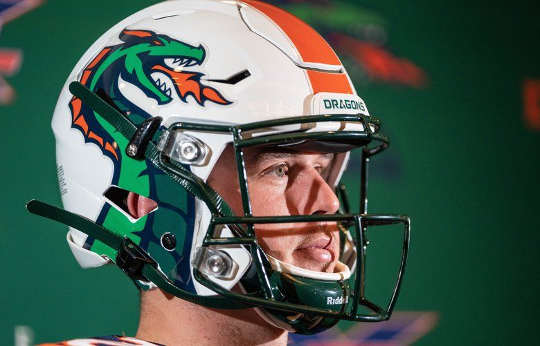
The Jaguars helmets sucked, but it wasn’t due to the concept. They just had exceptionally poor execution. I think a two-tone helmet can work. I think playing around with what is actually on the helmet can work. Look at the Seattle Dragons from the XFL. That works. The Guardians had a slightly more unique style too. What about a Panthers helmet with claw marks making the helmet look stripped instead of the Panther? Flames on the side for the Titans? A cityscape for the Giants? How about more helmets with a texture pattern? Stripes in locations other than down the middle? There’s a wide playground here, and I want to see what we could get.
This isn’t an important issue, but I’m always up for seeing what new stuff can be done.

sexy dude on cork board has a possessed face mask, holy fuckshit its dark play dave
he took it off for panel 2
its aliiiiiiive
Chargers have the best uniforms in the NFL. It’s too bad they’re waisted on a franchise that doesn’t deserve them.
No Dave,this is a very important issue that I’ve just been made aware of,you’re completely right that helmets need a makeover logo wise,jerseys get updated 2-4x before helmet logos do.I think everyone could benefit from having Bengals,Rams,Eagles,and Vikings esk helmets. Hell,most of these logos are the same for almost 20-30 years and some teams have never even redesigned.
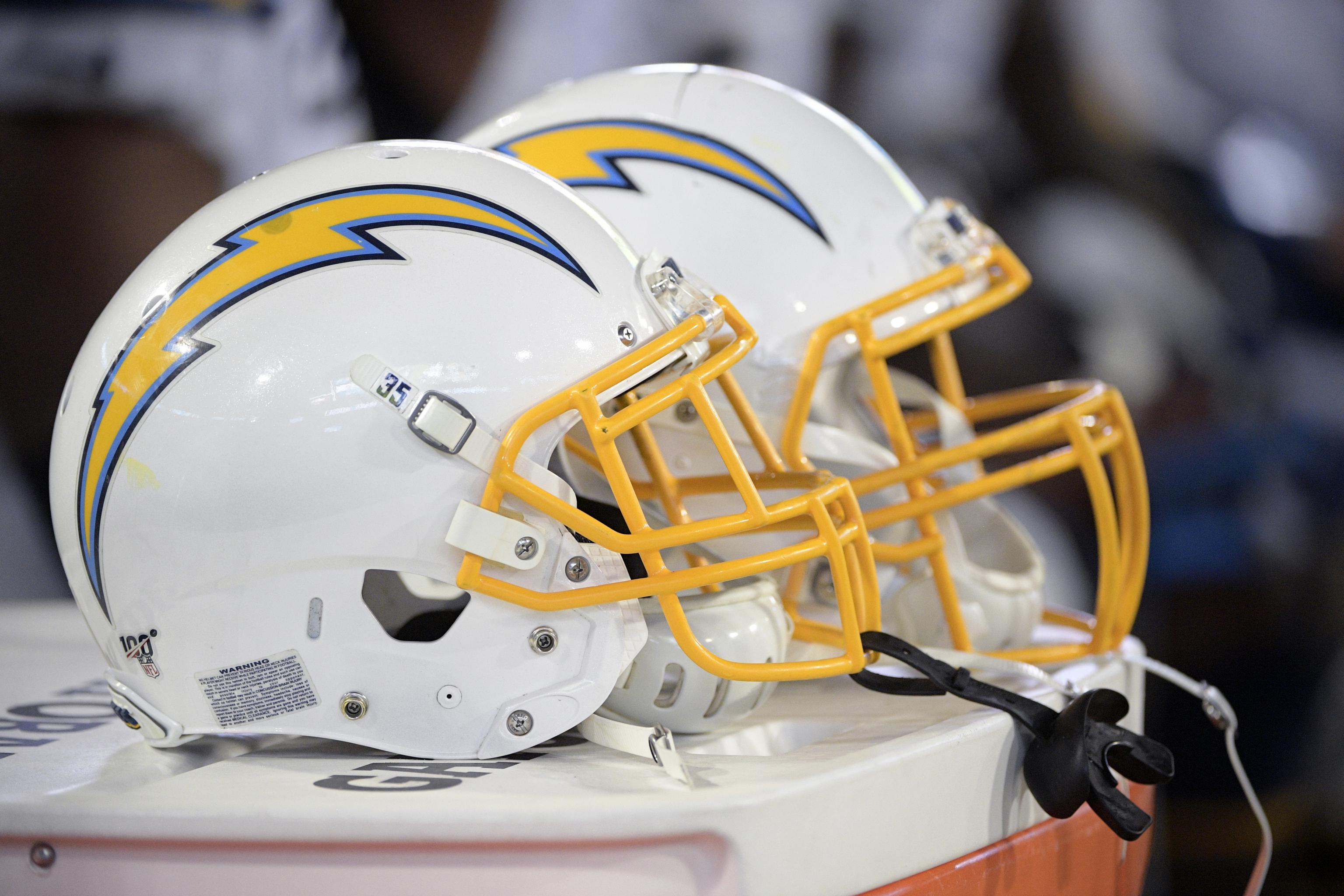
These are great uniforms. The keyline on the bolts looks so much better than the box they used for the last set. Even the CR uniform looks good, despite the fact that it feels like it shouldn’t. I think having the slightly darker gold helps with that, since it pops better against the midnight blue than the more pastel gold they used to use.
I’m split on the color rush unis here. Both are good looking, and the darker one honestly is too good to waste on just color rush weeks. The lighter one is too close to Rams colors, which wouldn’t be too much of an issue if the Chargers weren’t already dealing with being the second banana LA team.
Yeah the royal blue one is the only misstep in the set. It’s like Stan Kroenke put a rider in the Chargers’ lease that said they have to dress like their new landlords for one game a year. Not that I’d put that past him.
I’m sure people are gonna disagree with me but I don’t like the yellow pants. I feel like the blue tops with white pants and the all white jersey look better than the jerseys with the yellow pants
I completely agree. If they had only the four uniforms without the yellow pants that would be a solid lineup–possibly the NFL’s best. Those 2 yellow pant uni’s just detract from the who aesthetic.
I really don’t understand the love for the new chargers uniform. It’s fine I guess.
Vote those Seattle action greens? Fuck yeah!
Didn’t the Chargers have uniform numbers on their helmets decades ago?
I really like the TV numbers on the helmet. It was pretty common when the leagues first mandated them in the 1950s (apparently the NFL hasn’t mandated them since 2008, but I think every team still uses them), but as they started putting logos on their helmets instead they became standardized on the sleeves or shoulders. I really like it on a team that doesn’t have a logo on the side of the helmet, like the Chargers, and it doesn’t run the risk of warping or fitting weirdly over vents in a place where the helmet won’t usually have them.
Is it just me, or do the Chargers have more uniform combos than any other team in the NFL?
They’re tied with a couple others. Buffalo, Carolina, Cincinnati, Houston, Miami, and Tennessee all have 6.
Jacksonville has worn 8 different combos (out of 9 possible).And Baltimore actually has 9 combos (but could add a 10th in black over purple). Technically Carolina and Houston could join this club too, but thus far have not chosen to mix and match that much.
to be fair its also pretty hard to fuck up blue and gold
I love the Chargers unis. I’m not big on the helmet number. But it could grow on me. Overall, I’d say finally a decent job on a redesign. Also, the Guardians uniforms are better than quite a few current NFL sets.
The Chargers are really out here winning everything except football games…
And fans.
Is there any sports organization that has a greater disparity between the quality of its uniforms and its mangement than the Chargers?
The Bears and Maple Leafs come to mind. The Knicks too.
I’m probably in the minority on this, but I’m not a fan of these uniforms. The colors are great, the simplicity – helmet numbers aside – is great, but then… those @#$@(* lightning bolts. It feels like some thoughtless child just slapping stickers on their trapper keepers to make them look “COOL”. You can put a lighting bolt on the pants and the helmet, OR the shoulders and the helmets. But on the pants, the shoulders, and the helmet???
Oh dear lord, no.
As opposed to putting matching stripes on the shoulders, pants, and helmet?
Ya I agree I think the bolts make the uni’s look better and it is a better look than white stripes would be.
If it didn’t look like clipart dropped out of Power Point, I would agree with you. And I’ll admit, there are only so many ways to draw a lightning bolt in that kind of space. But. The way they did it… for all intents and purposes, it *IS* a stripe, albeit a ‘cool’ jagged one. They could have made it beefier and less stripe-like, which would also help differentiate it from the helmet and shoulders.
Like this fan concept from Alex Rocklein, where the jersey and the pants get a different bolt treatment. I’m just a firm believer that if you’re only going to put 3 things on your uniform, it shouldn’t be the same thing repeated 3x. I’m generally not a fan of the LA on the helmet, but he snuck a lightning bolt into the negative space, which… just, gotta give props on that:
https://c1.staticflickr.com/1/547/32387958496_a258d31bdb_h.jpg
PS – having just googled the Chargers unis, I’m going to acknowledge while I don’t love them, what they’re going with *IS* a significant improvement over the bolt/stripe combo atrocity they were rocking until now. They should have canned those during their 2017 logo redesign controversy. XD
“I’m just a firm believer that if you’re only going to put 3 things on your uniform, it shouldn’t be the same thing repeated 3x.”
I’m exactly the opposite. If you’re going to have a simple design it should be somewhat unified for maximum impact. I also really hate that design. It looks like the worst example of the CFL/Arena style that was popular in the early 2000s.
I agree with your logic, I think we just differ in the execution of it, which is totally cool.
I’m all for a unified presentation, I just like to see it done via complementary elements forming a cohesive design, not creating cohesion by using identical components multiple times.
This may sound a bit cheesy, but what if the vertical portions of the N in NY were the Twin Towers? BTW: It’s your fault I came up with that making me think about potentially improving the Giants logo…
I can honestly say this is the first lineup in a long time where I think they all look awesome. The dark Navy blues especially. Not sure how I feel about the numbers on the helmet right now, but it’s something I’ve never been against, either.
The XFL Seattle Dragons helmets remind me of the USFL Michigan Panthers helmets, with the mascot rising up from the bottom of the helmet. Carolina should borrow it, it looked awesome.
I don’t like the Chargers uniforms. They look too much like UCLA’s uniforms with yellow instead fo metallic gold. In fact I thought Dave was going to make a Colorize joke lol. Maybe next time
Jags’ gradient helmet didn’t last long. I remember Shad saying that it symbolized a jaguar coming out of the shadows but that didn’t make it any more palatable. And man did it ever look weird on video games.