
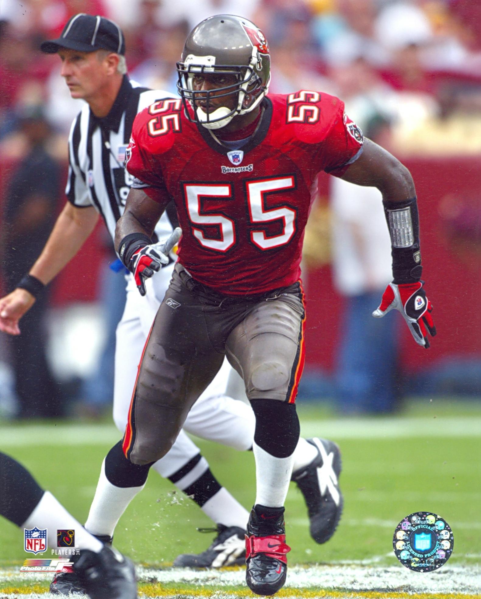
The Bucs “New” Uniforms
So I’ll come right out and say it: this might be the best uniform redesign since Nike took over! They look great! I have loved a couple of the new Nike uniforms (Seahawks and Vikings) and been bleh on most of them, but these? These are fresh as hell. I love it. I love the deep solid red. I love the pewter pants with the stripe. I love they way the creamsicle outline is there, used sparingly. I love the shiny helmet and I love the return to classic numbers with the double color outline. It just looks so…wait. That picture…something’s off about it.
Oh. It’s Derrick Brooks. From the early-2000’s.
You’d be forgiven for not realizing that at immediate glance. This is without a doubt one of Nike’s best efforts…but it doesn’t feel like we can actually give Nike credit here, can we? They just straight up stole the previous Bucs jerseys. It’s the same fucking uniform (at least for primary home). If they wear the pewter pants with the away jersey it’s even more blatant. The only thing new here is the color rush pewter alternate and they kept the “big logo” helmet from the last design. Is it better than the last version? Of course it is! Is it new, or exciting, or different, or fresh? No! It’s just the same damn uniform!
As good as the “new” duds look there’s a part of me that can’t help but feel let down. I like it, and I love that they kept the new helmet (I actually love the big logo helmet). I also actually like the full pewter alternate. I don’t really have any complaints about this uniform at all, except the fact that’s it’s not new. It’s a cheat. I was hoping they’d take the ugly ones and refine them into a more classic style but still retain some modern elements outside the helmet. Something akin to the Jaguars “fix” a few seasons back. The Jags new look was a bit too minimalist for me but at least it wasn’t a complete regression to an old style. Not even a regression, just straight up reversion.
So, in short, the Bucs new uniform is great. It looks fantastic. It just isn’t new at all. The only “new” part of this look is the helmet, which is still just the previous helmet carried over. We already had this era of Bucs, I would have appreciated at least some more slight differences instead of a straight reversion to the previous look. The new helmet and pewter alt don’t feel like enough to save it from being a carbon copy of the old look. The alarm clock numbers of the previous jersey was hideous, but at least it felt like an attempt to be new instead of just jerking off to former glory.
I’m guessing this will go over very well with the public though because nostalgia sells, and I fully expect the Browns & Falcons to do something similar when they unveil their new look. Both will probably be improvements (which this is, again, don’t get me wrong), but I hope they can still give us at least something a little different and modern in each.

Needs a Sexy Rexy tag. We miss him y’know.
My gripe with the now old Bucs unis was the numbers typeface. Those inside lines to make them look like old BCD displays were so random and out of place.
man, I hope the Browns also bring back the older look too; why teams keep “fixing” what isn’t broken is just beyond me
Looks like your wish was granted https://www.google.com/amp/s/www.cleveland.com/browns/2020/04/browns-release-new-uniforms-ranking-the-jerseys-of-all-32-nfl-teams.html%3foutputType=amp
Why are there two sets of pewter pants with different striping? Why not have a full red/cream set that the team could mix and match with? WHY IN THE HELL ARE NFL TEAMS NOT DOING ALTERNATE HELMETS?
Because the NFL only allows them to have one helmet, I imagine
The answers to 2 and 3 are both because of the one shell rule. A white helmet wouldn’t look good with their current color set, and the creamsicle uniforms wouldn’t look good with helmets in any of their current colors, so they don’t have them. I think the team said they’ll bring back the creamsicles as an alternate if the league ever lifts the one shell rule.
Going back to the classic uniforms would be a good move, but I feel like the Browns could simplify the new set and it would look more like an evolution and modernization of the classic uniforms, rather than the radical departure the current set are. Take out the drop shadows and contrast stitching from the jerseys. Keep the “CLEVELAND” wordmark on the chest. Replace the “BROWNS” wordmark down the pants leg with a full length stripe. It looks 1,000 times better than the current set, and looks clean without just returning to the classic set.
I’m so happy they went back to the old duds. I miss the pewter power. Honestly i wish they just went back to the 2000s flag logo too, but making it bigger on the helmet.
1 more thing to add, the white pants is actually what Tampa Bay wore during the 1997 season (the 1st pewter season)
I don’t understand why they still employ the guy on the left. It’s always the guy on the right making the big earth shattering discoveries.
He has tenure.
Every post on the internet about uniform redesigns should just be titled “Get off my lawn!”. I personally like change with uniforms. Not every new design is great, but none are as bad as people make them out to be online, and none are as bad as the Colts/Giants types ones are boring and tired (also the Browns lack of logo helmet of the wrong color). Those teams should at least TRY to modernize.
We are now in an era when the creamsicle Bucco Bruce uniforms would once again go over well as a primary look and I’m a tick disappointed that the Bucs didn’t try to update that look (mostly because I first became a Bucs fan during the Vinny Testaverde era) for the new primary uniforms. While NFL teams are notoriously stodgy when it comes to logos and uniforms, I expect the Bucs favored going back to the old pewter design over anything creamsicle because they were generally really terrible in the creamsicle (3 playoff appearances, 6 seasons of fewer than 4 wins). Too bad, but I get it, and I liked the pewter and red era Bucs quite a bit too. Among 90s-debuting NFL logos, the sword-and-flag is probably the best by a good-sized margin (honorable mention to the Jaguars).
Soooo… How bout those Falcons new “AAF” jerseys?
That’s what I’m saying. They look like the Atlanta Falcons of the XFL
My response to the introduction video was that the same team who almost won a Super Bowl, almost showed us their new jerseys. That intro video was horrid. “Here, have a seizure, also, NEW UNIS!”
Those two don’t look like they are 6 feet apart *AAACHOOOO*
And now we know what Tom Brady really asked for before he signed, “I want to play for a winner, a team that really wants to be taken seriously…”
“Quick! Hit undo on the Jersey design!”
Brilliant
Chargers are coming out with new uniforms on April 21. I am praying that they don’t overdue it and ruin them
Also rip in peace Niketober 2015
Do you have a source for that date? I’ve been looking for it and can’t find it anywhere.
And then the Atlanta Mean Machine has a gradiant on their alternate.
sort of annoyed that Nike is coming up with these goofy clown suits for every team so that five years later they can go back to selling you the same jerseys they changed from, but marked up because now they’re “new”
I’m guessing you have ideas for the Falcons one too, but might I humbly suggest the Nike people say “You can copy paste from old designs?!”
The Falcons clearly recycle elements from other failed recent redesigns. They’ve got the drop shadow numbers and prominent city name from Cleveland, a bold new number font nobody had seen before like Tampa, and edgy lines with a matte helmet and a gradient fade (now on the jersey!) from Jacksonville. It’s like a Frankenstein monster of all the corpses of recently discarded redesigns.
And much like those others, my guess is in five years they’ll realize they went for the flashy midlife crisis uniform and revert to a boring, conservative, old school one just like the Browns, Bucs, and Jags. Probably after playing out the last year or so wearing their throwback alternate uniforms as much as possible and pretending the other ones never happened.
Also the picture at the end could have Matt Ryan either near dumpsters or a laboratory with discarded jerseys of the other teams clearly missing pieces where they’ve been cannibalized for parts.
Am i the only physical being in the universe who liked the 2015-2019 uniforms
No, I liked them too. The numbers were a little weird, but I’m not sure why every uniform needs to look like the 1950s for people to be happy. Design styles change. I like Nike trying new stuff.