
The Jets New Look: The Old Look
Let’s start off uniform week with the dullest of all the updates to talk about: the Jets. They just brought back the sack exchange era uniforms. That’s it.
When the Jets previous era (henceforth referred to as the Milf-era) was released, the update was generally panned. I didn’t hate it as much as most but I didn’t love it. Thing is, that uniform grew on me. I still didn’t like the NEW YORK above the numbers and I generally think that entire design element should stay in college where it belongs but the rest of it was fine for me. It looked good in motion on TV from far away. It wasn’t special, but it worked well enough that I wasn’t craving a change.
The new update (post-Milf?) has been generally lauded. I agree. It is an upgrade. But I will disagree with most of the praise and say that it isn’t much of an upgrade, and it isn’t perfect. When I go back to my comic about the previous Jets uniforms I wrote “I’ve also seen it described as one of those generic sports jerseys you see in commercials where the company can’t use a real uniform so they have one that vaguely resembles a real team.” It’s funny to read that now because it is exactly what I feel about the update. The previous version looks far more unique in retrospect. The shoulder spike that reached far into the collarbone is an idea we haven’t seen elseware on an NFL uniform. The new one is just horizontal stripes, same as every other horizontal stripe ever. It looks exactly like what a fake knockoff Jets jersey would look like in a commercial where the company didn’t have the rights to an actual Jets jersey.
Something about it looked just a bit off to me while I was perusing the pictures. Looking back on the original sack exchange era, I was able to put my finger on it. The sleeves. In the old NFL, uniforms had sleeves. The stripes could be lower on the sleeves. These days, most uniforms have no sleeves, they are crinched right below the shoulderpad and essentially end above the bottom of the average deltoid muscle. The stripes can’t be on sleeves anymore, they have to be compressed into narrower stripes and placed higher up on the shoulders, which are much smaller now thanks to modern pad design. This isn’t a major problem in any way, in fact I feel like a fool for even talking about such a small thing, but it shows how you can’t just bring back old looks without thought. Rodgers still has sleeves, but it doesn’t feel quite right. But it feels right enough to still be an upgrade.
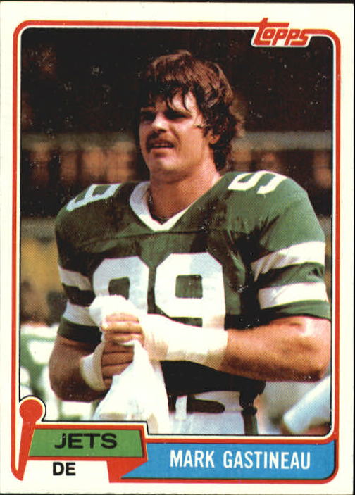
One major positive: they brought back the old 70’s Jets logo with the woosh jet shape over the letters. Outside making a brand new good logo, that was the best decision they could have made. The Jets logo has always been a waste of potential but the one they brought back was easily the best of them all. Well, almost the best, but we will never get angry jet face on a helmet.
Last thing of note: fuck black alternates. Stop the black alternates. Stop it. Fuck you. It looks the same as every other fucking black alternate. Do something weird instead.

Gilf?
Empty Nest Mom?
*standing up* I like it. Also, fuck the BFBS.
Happy Niketober everyone
Main Jersey: 8/10
Away Jersey: 10/10
Alternate Jersey: 1/10
Helmet: 9/10
I might be an uncultured swine but I don’t see the black alternates really bad. I actually like them a lot. They can of course look bad like the Iggies stupid dark unis, but I think they can be sharp like the Cardinals, Panthers, Ravens, Steelers, and Commies. And so what if everybody has all black uniforms, They still look good and nobody is going to wear black against each other.
3 of the teams you mentioned have black as a primary color. not an alternate. That’s why they look good, they are designed to be worn all the time so they put effort in instead of slapping black on a team without any.
All the other alternates just look like weak copies of those teams. The Commies black uni especially just looks like a weaker Steelers uniform
Glad someone said it about black alt jerseys. I get it, sometimes they’re pretty cool, but every comment I see when a team drops a new black alt is “black ones fire”. They very seldom are. The new black alts for the Lions straight up look like Carolina jerseys. It’s just lazy and mediocre, and I snobbishly can’t stand when people praise mediocre design.
This. They get very samey and lose what makes every team unique. The Jets are Green and White. You can incorporate black in their alternate since they are one of the teams where their colors can pull it off, but it needs to incorporate the white too. I prefer it when the alternates are throwbacks to an older uniform style even if it is an ugly one.
It’s funny to me that the Jets previous uniforms, let’s call them the Curtis Martin era, were just throwbacks to the Joe Namath era. The Sack Exchange unis are technically the newer design, but they used the retro design long enough for the SE unis to feel older. Are the Jets doomed to spend eternity vacillating between two designs, using one just long enough for a new generation to “rediscover” that the other is “totally way better, actually”?
They’re both good designs honestly.
“Are the Jets doomed to spend eternity ______?”
Yes. The answer is always yes. Eating waffles? Drinking rubbing alcohol? Yes, yes, yes.
Gotta say that I prefer the classic toothy version of the two NFL designers.