What If Uniforms, But Historical, and Stupid
When I was making the comic for the Giants Centennial Red uniform release, I expressed a desire that the league should have one week where every team wears ugly throwbacks from their past. I think it would be a lot of fun to see something so silly! It would make a lot of traditionalists who hate any uniform variance whatsoever very angry, but it would make me very happy, and I am more important than those people, so the league should listen to me.
That started some mindless thought trains shooting off to different stations in my head, and I started to wonder what that would actually look like. I came to the exact same realization that many of you likely already have: what about all the teams that don’t have ancient uniform history to draw from?
The Texans, Jaguars, Panthers, Ravens, etc…all fairly new franchise looks without much history to look back on. It would be strange to pit the Steelers in their bumblebee uniforms against the Texans “historical” uniforms, which is basically what they wore up to last year. So, instead of a wandering brain, I now had a working one. I could figure it out myself.
The point of this little project was to find every team’s dumbest old look, from as far back as was possible. Preferably the leather helmet era when football still showed many of its rugby roots in aesthetic, and as you’ll see, all but a couple of teams are 1960 or earlier. For teams that didn’t have history reaching that far back, I would invent history for them, based on the styles of many long-defunct football franchises.
For each team without history, such as Carolina, I would try to find the closest analog I could find among the old and forgotten early 1920-30’s teams, when half the teams would fold every year. It wasn’t always close, and it wasn’t always possible to find something even vaguely related, so as mentioned for each team liberties were taken. I also took a few small liberties here and there for each team if I felt like it.
Ultimately this was mostly just an excuse to delve into a little football history and learn about old stuff. I had two major sources for this: The Gridiron Uniform Database, and an old blogspot blog for heritage uniform history.
NFC East
- Giants
-
-
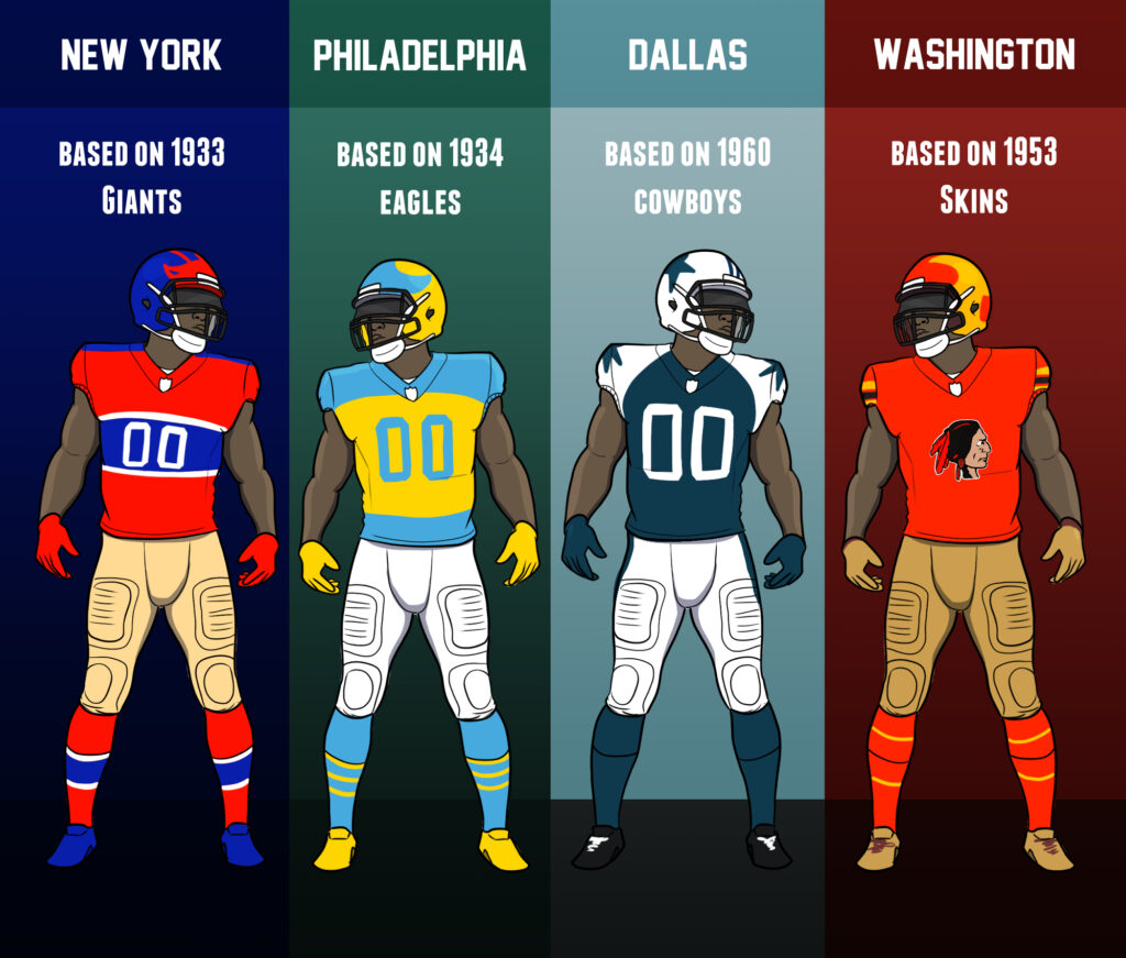
- The Giants 100 year uniforms this season are not a 1-1 translation of any particular look in their history. The uniform with the middle stripe outlined in white with white numbers is closest to the 1933 look, and the helmets are from 1938 to 1947. The Giants are one of the teams with the most history here, as one of the oldest surviving franchises. There are a lot of stupid looks they could have used, but I think they picked the best one.
-
- Eagles
-
-
- For the first 3 years of their existence, the Eagles had light blue as a primary color. For the 1934 Eagles, they used yellow as the other primary, and it was ugly as hell. We saw a version of these in action many moons ago, but the helmet worn that day doesn’t appear to ever correlate to an actual historical helmet in the Eagles history. The Eagles appear to have made that shit up, as that style leather helmet wasn’t used until Philly had already moved on to green as their main color.
-
- Cowboys
-
-
- Like a lot of teams in the league, the current team started in 1960. The Cowboys have stayed remarkably consistent through the decades without much variation, but the early look focused on the shoulder stars that we do occasionally see a modern variation of.
-
- Commanders
-
-
- The Commies started as The Boston Braves, but in 1933, the first year with the Skins moniker, they had a design I was not expecting to see at all. Hard red, with yellow and black stripes, and the logo of a native on the front of the jersey. I did love how the helmets looked and kind of want to see a modern take on that. I’m curious if the franchise will ever have a historical celebration day with the problematic name now officially in the past and awkward to bring up, even in proper context.
-
NFC North
- Vikings
-
-
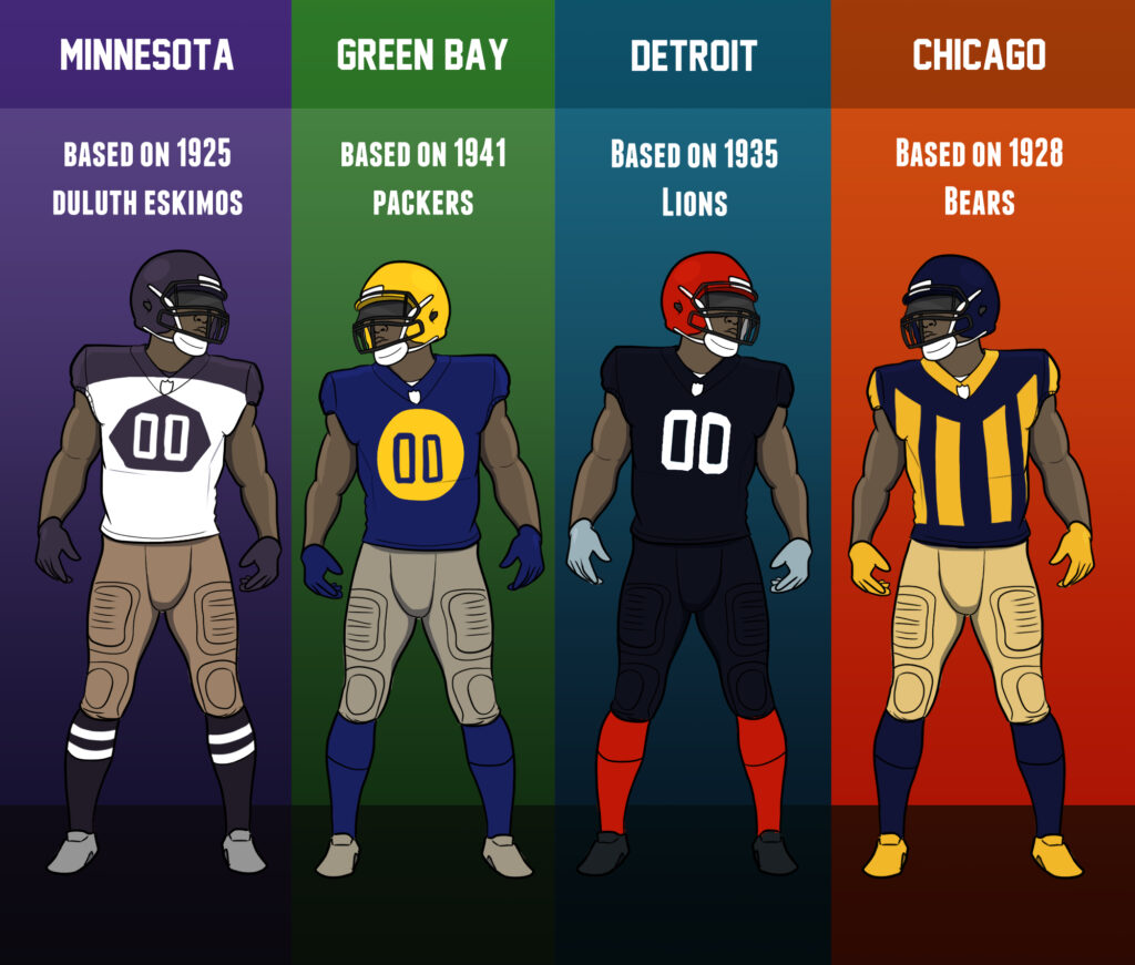
- The Vikings did not exist till 1961 and they looked like the Vikings straight out of the gate. No awkward aesthetic history here. So fuck that, lets take a defunct NFL franchise from Minnesota, the Duluth Eskimos, and adapt them to the Vikings instead. The Eskimos had a very unique look, almost a hockey jersey, and I think it’s neat. If you don’t know where Duluth is, it is like Green Bay but worse.
-
- Packers
-
-
- The Packers went through a lot of variation and I had my pick of the litter in terms of ugly early looks. I went with the large dot variation they used once because that was my favorite amalgamation of the bunch, though it was tempting to pick the ones that just say ACME PACKERS on the front
-
- Lions
-
-
- The Lions started as the Portsmouth Spartans until 1934. They had the basic blue and grey scheme from the start of their relocation to Detroit…except for 1948, when they got extremely stupid for some reason and spent a year with a red and black uniform. This was the result of the coach at the time trying to mimic Indiana’s uniforms. I’m glad this did not last, because wow! It’s terrible! Red and black and white? Terrible. Sorry Falcons didn’t mean to hit you with a stray there.
-
- Bears
-
-
- Another team with ancient histories to root through, the Bears go all the way back to Rugby stripe style that looks utterly hideous on modern uniforms. I want to see an entire week of nothing but modern attempts at this, it would be chaos.
-
NFC South
- Falcons
-
-
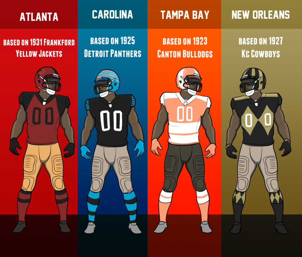
- The Falcons had no history from the era and no historical local analog or namesake, so I looked back through the forsaken teams and discovered the Frankford Yellow Jackets. I adapted their colors to the Falcons scheme and came up with this mess you see above.
-
- Panthers
-
-
- A team with no history whatsoever before the 90’s, and no local defunct squads to draw from. However, a team named the Panthers existed before, based in Detroit for 2 seasons in the 1920s, so I adapted them. Fun fact, the current Michigan UFL team is named The Panthers, possibly carrying on this legacy of being a joke team that doesn’t last?
-
- Buccaneers
-
-
- Tampa Bay starts in 1976 with the creamsicles and I will hear NO disparagement of those classics. I decided to pick a random defunct team, the Canton Bulldogs, and adopt their unique double lower stripe design and give it the creamsicle colors.
-
- Saints
-
-
- The Saints began in 1967 and looked like The Saints immediately. So I went back to Kansas City, an old defunct Cowboys team from 1926 that looked like horse jockeys. Imagine trying to put big diamonds on current uniforms. We’d never stop laughing.
-
NFC West
- Seahawks
-
-
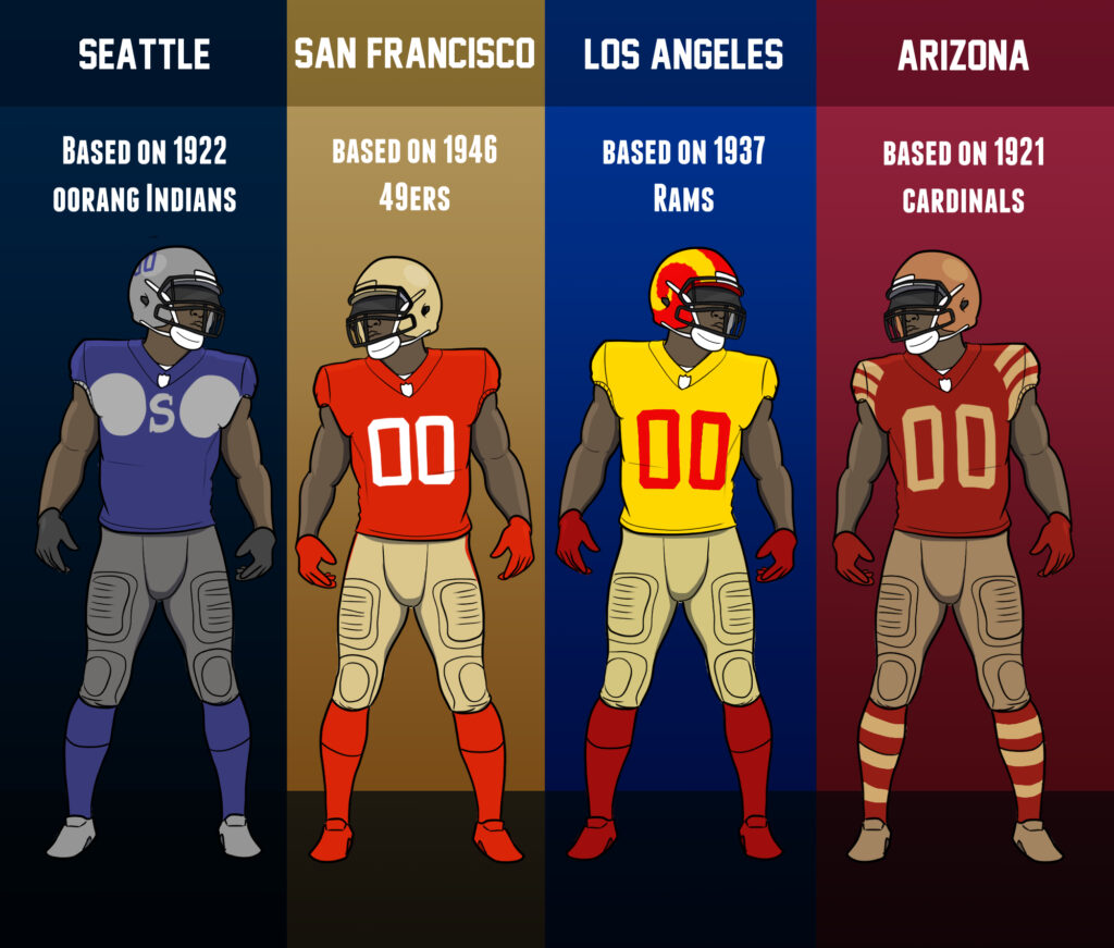
- I had no good ideas for the seahawks, but I really wanted at least one uniform to have the incredibly stupid look of the weird extended pit stains that many old uniforms had, so I went with the 1922 Oorang Indians. The Indians were a unique franchise, a travelling band of actual Native people playing football, without a “home” city. Honestly a band of Native Americans not having a place to call home is darkly appropriate for this country.
-
- 49ers
-
-
- The 49ers are a pretty old franchise, going back to 1946, but they’ve pretty much stayed consistent in style through the years. They were just more plain back then.
-
- Rams
-
-
- Fun fact! The Rams are the only NFL team to win a championship while representing 3 different cities. Los Angeles, St. Louis, and way way way back in the day, Cleveland. For this one I was torn. In their very first season in 1937, they basically wore a modern day Black Alternate for one year. Then they moved into the expected blue/yellow/white scheming they’ve mostly kept since. Except, that in 1949, they decided to be stupid and go Red/Yellow. I liked that look more than the fairly plain black/red starter kit, but I would watch the modern Rams in either.
-
- Cardinals
-
-
- With how pathetic the Cardinals franchise is historically you can be forgiven for forgetting how old they actually are. I liked the 1921-25 iteration the best, with the three big arm stripes. Modern NFL uniforms don’t have sleeves, so I had to shove them into the shoulder area to make it work. If they made players wear athletic sleeves with these uniforms we could have more possibilities.
-
AFC North
- Steelers
-
-
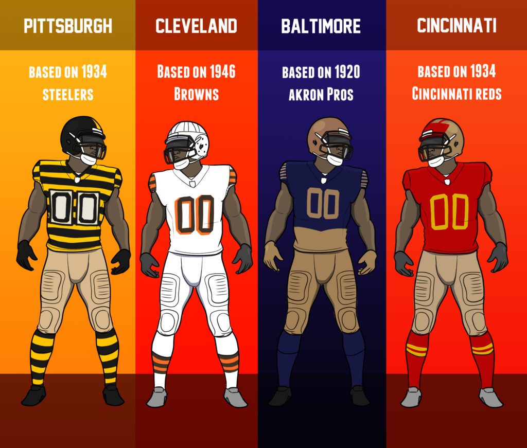
- You know them, you love them, they are perfect.
-
- Browns
-
-
- Thanks to professional football essentially originating in Ohio there is no shortage of Ohio based teams in history. Most are long defunct, and the “current” Browns didn’t appear until 1946. But they looked like The Browns pretty much instantly outside the white helmet. The Orange helmet didn’t become a staple till the 50’s.
-
- Ravens
-
-
- Speaking of defunct Ohio franchises, the Akron Professionals! Specifically the 1920 version. STRIPES! The Pros only lasted 6 years but in a rare case of brand identity in the 20’s, kept consistent looks.
-
- Bengals
-
-
- The Bengals came to be in 1968. I almost went with it anyway, because they looked pretty much exactly like the Browns, just with BENGALS written on the helmet itstead. We all know why, Paul Brown got ousted from the team literally named for him and went to Cincy in spite to form the New Browns, with blackjack and hookers. Sadly, as much as I loved that BENGALS helmet, I wanted older, so I went back to a defunct Cincy team, the Cincinnati Reds! No, not the baseball team, the football team of the same name that vanished after two seasons.
-
AFC East
- Pats
-
-
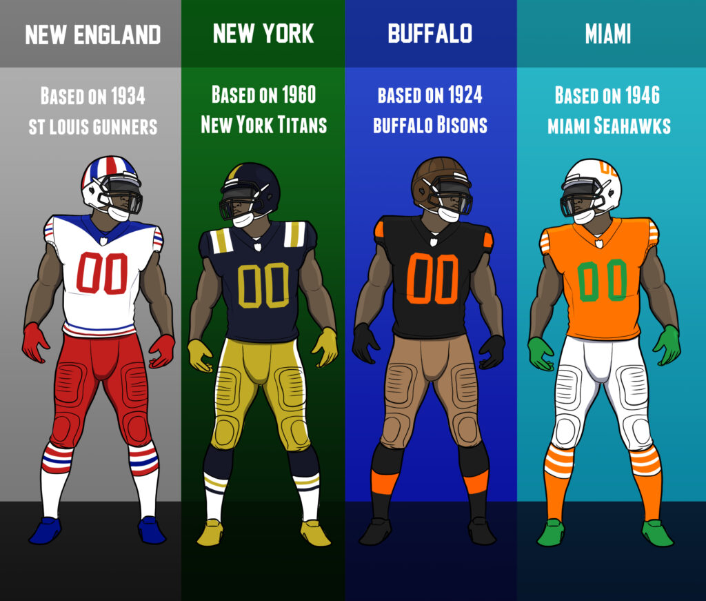
- There were a few teams from Boston in the very early days, but considering the Patriots color scheme, I went looking for the most Red/White/Blue combo I could find, and in the dumpster bin of history I found the St. Louis Gunners from 1934. They existed for one year. They had a cannon logo. I am sad this team is gone. If they ever expand back into St. Louis, I want this theme to be resurrected.
-
- Jets
-
-
- We’ve seen these worn before a couple of times. The Jets were once called The Titans for their first few years, and their color scheme was this weird mess. I kind of like that for a time, the two New York teams were named for very large men. Imagine if they had stayed that way and still played in the same stadium. Big Boy Stadium would be the only acceptable name for Metlife.
-
- Bills
-
-
- Buffalo has a proud football history! The current Bills are a 1960’s formation, but they are the SECOND team to use the Bills name, one iteration existing in the 40’s for a few years. Yet, before even that team went defunct, another Buffalo team existed, called the All-Americans, and then The Bisons.
-
- Dolphins
-
-
- Only one team prior to the Dolphins has ever played in Miami. They were called the Seahawks. This team would only play as the Miami Seahawks for one season in 1946, when they would move to Baltimore and become The Colts. No, not that one. I’ll get to that.
-
AFCSouth
- Titans
-
-
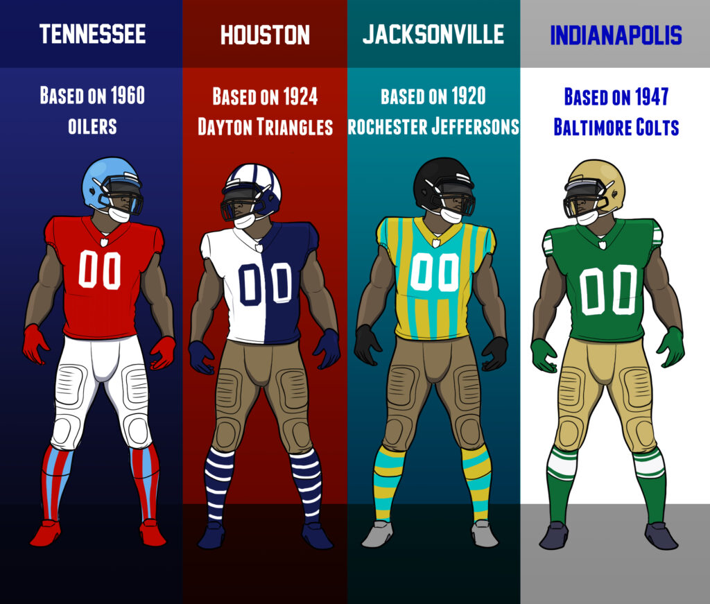
- The Titans, formerly the Oilers, began existing in Houston in 1960. They looked like The Oilers immediately, so I took a few liberties with it to make it slightly uglier.
-
- Texans
-
-
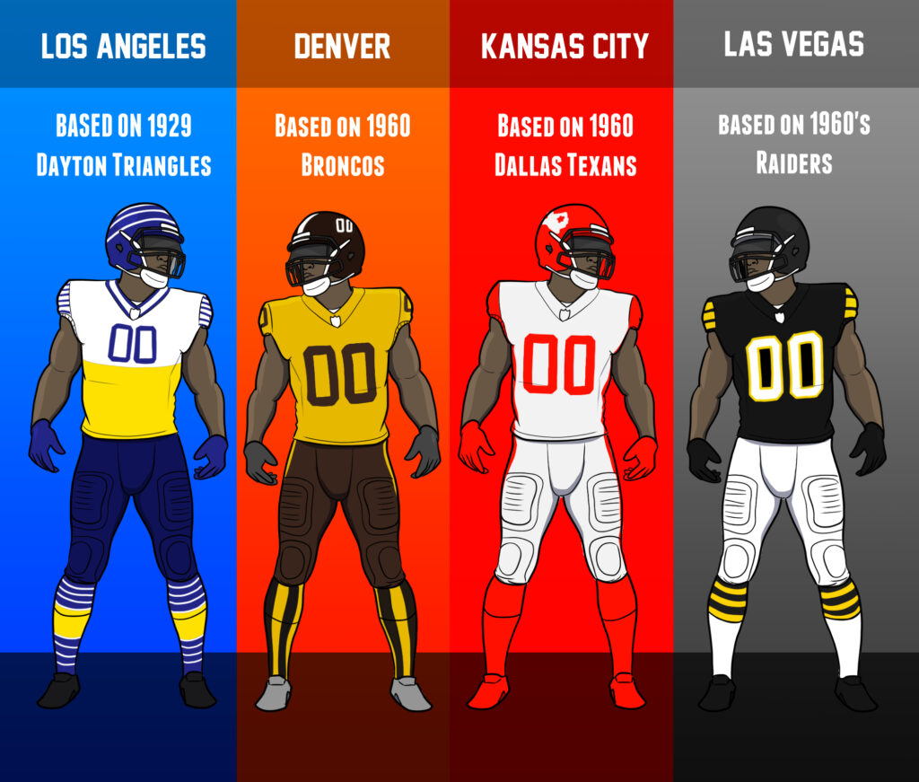
- Since Houston is effectively the newest franchise now, they have the least amount of history, so I went looking for the dumbest look I could find in the dustbin to apply to the team instead. The Dayton Triangles should be studied in college courses because they never wore the same look twice, and all of their looks are bonkers. This split look is the 1927 version. The Triangles also have a surprisingly long history, lasting from 1920 to 1944, becoming the Brooklyn Dodgers in 1930.
-
- Jags
-
-
- Jacksonville obviously never had any football history before the Jaguars showed up, so I went to Rochester, New York to snag an edited version of the Jeffersons. Out of every team here, this is the one I took the most liberties with.
-
- Colts
-
-
- The current Colts used to be based Baltimore. However, that franchise was named the Colts after the previous version of the Baltimore Colts (The former Miami Seahawks) went defunct. Confused yet? After one year as the Seahawks these Colts, using green as their color, would last 4 more years before busting. The next iteration of the Colts would be given the Colts name to honor the history.
-
AFC West
- Chargers
-
-
- I’m telling you the Dayton Triangles could not settle on a style and all of them were bonkers. Out of every defunct football team, this is the one that’s the most fun to research. The Triangles were also a team without a home, a long lasting road warrior franchise, which makes sense for the Chargers, a team that technically has a home but is not respected there.
-
- Broncos
-
-
- We know this one. The dreaded vertical stripe socks on the brown poop pants. I can’t believe this color scheme didn’t stick around! We could have had the pee pee poo poo team.
-
- Chiefs
-
-
- The Chiefs and Cowboys both came to be in Dallas in 1960. Like playground children, they both wanted to be the Cowboy whilst playing Cowboys and Indians, and eventually daddy NFL Cowboys won and the Dallas Texans limped off to Kansas City and played the Indians, renamed Chiefs. I want the Chiefs to bring back the Texans scheme for one game, preferably against the Houston Texans.
-
- Raiders
–The Silver and Black is iconic in Raiders history. So you might be surprised to find out the first few years of Raiders history has a bunch of yellow in it.

>”If you don’t know where Duluth is, it is like Green Bay but worse.”
Oi! At least we have the lift bridge!
TBH though city’s never fully recovered from the shuttering of the US Steel plant in 1987, and the Iron Range up north hasn’t been doing much better.
Don’t forget the Bong Bridge, that name always makes me giggle.
Isn’t it the Richard Bong Bridge? So Dick Bong, even funnier.
I know the creamsicles are awesome, but I’ll be damned if Tampa Bay shouldn’t be based of their true predecessors, the Los Angeles Buccaneers, with the logo on their helmets as well.
Highlights:
-The unnatural “delve” (it hurts my brain)
-Always make us remember that the Dayts (they merged with the Boston Yanks in 1944) never reused uniforms.
-Schtewpid alternate “uniforms” forever
-The Boncos are toilet humour (that’s not what he wanted to cook!)
-Never sticks to the team’s own historic uniforms, uses defunct teams’ uniforms to keep it stupid
-Naïve Nike designers are now skint and on the dole until some team asks for schtewpid new juniforms.
Summary
Awesome non-comic compiling ridiculous uniforms from old history, not all defunct teams left out. Dave can (somewhat) comedy. Still not enough swooosh. Grade: A (on a D- to A+ scale)
The Eagles Yellow and Blue is an ELITE uniform! Colors match well (and are the colors of the Philly Flag to boot) and the design is great. They need to wear them more!
(sees Dave make fun of the Cincinnati Reds)
“I don’t care if its the football Reds that someone was worse than the ’90s Bungles, but nobody, BUT NOBODY MAKES FUN OF THE CINCINNATI REDS NOT SOME SLOW COOKING, SLOW DRAWING PIECE OF—”
(sees the actual uniform the NFL Cincinnati Reds used)
“…the hell is that?!”
Worth the wait
Naive Nike Designers: “YOU CAN RUN A SLIDESHOW WITH ARCHIVED FILES?!”
Fun fact: a reasonably coherent argument can be made that the Dayton Triangles still exist as today’s Colts, which would make them the oldest surviving team in the league after the Cardinals (since the Triangles had existed in some form since 1913). The timeline is more or less as follows:
– 1920: Triangles join the nascent APFA (soon to be renamed NFL)
– 1930: Triangles are sold to new ownership and become the Brooklyn Dodgers
– 1944: Dodgers change their name to Tigers, briefly adopting a matching black/orange color scheme; Boston Yanks are founded (named because their owner wanted to play in Yankee Stadium)
– 1945: Dodgers merge with Yanks as one of the wartime desperation teams, “The Yanks”
– 1946: Where things get weird: the former Dodgers owner buys a new franchise in the AAFC, the New York Yankees, leading to his NFL franchise getting cancelled and the players being reassigned to the Yanks, who return to Boston. Because that isn’t confusing enough, there’s also a new AAFC team playing under the Brooklyn Dodgers name
– 1949: The AAFC Dodgers are merged into the AAFC Yankees; the NFL Yanks finally move to New York as the Bulldogs (who are terrible, going 1-10-1)
– 1950: The AAFC folds and the players from the Yankees are split between the Giants and Bulldogs, who change their name AGAIN and become the New York Yanks
– 1952: The Yanks’ franchise is either sold or cancelled after a 1-9-2 season, and the player contracts are purchased by NEW new ownership and play 1952 as the Dallas Texans … who are even worse under the new name, leading the Dallas ownership to sell the team to the league in the middle of the season. They play out the season as a traveling team and finish 1-11
– 1953: The NFL awards the remains of the franchise to a Baltimore ownership group as the revived Colts
Officially, the Colts don’t claim any prior history, and the NFL regards the Texans as the last NFL team to have folded. But you can make the argument.
Came here to make a very similar comment, thanks for doing the hard work of laying it all out. I would say it’s much more than a coherent argument, it’s pretty much DA FACTS. The NFL and the Colts are just trying to sweep their high school years under the rug and pretend they don’t exist, the way Jim Irsay tries to sweep his… well, you know. We won’t go there right now.
Even the Triangles’ wiki page comments on it:
“In spite of the unbroken continuity of the franchises that began with the Triangles in 1913 and the Boston Yanks from 1944, the NFL and the Colts organization currently do not consider the Colts to be a continuation of the Triangles or any other franchise.”
Nice to see Jacksonville is movin’ on up.
It is quite fitting that the Lions, the Indiana Hoosiers of the NFL, borrowed IU’s look one year.
For the Texans I would have suggested borrowing the awful lemon-lime color scheme from the World Football League Houston Texans… a team so successful at the box office that it moved to Shreveport (!!!) mid-season to become the Shreveport Steamer. It is not every football team name that sounds like something I refuse to look up on Urban Dictionary.
SUCH an entertaining read, excellent job, man!
STEELERS BUMBLEBEES 4 LYFE
Minor nitpick, but the raiders original uniforms were black and gold rather than black and yellow. They just looked yellow because everybody just collectively sucks at making an actual gold colored uniform.
*cough*Saints*cough*
Though seriously, the insecurity of some fans whose team does have yellow in their color scheme is really funny to me.
Packers: “Green and gold!” Steelers: “Black and gold!” Vikings: “Purple and gold!”
Bitch, it’s yellow. Gold isn’t bright yellow, it has a distinctive hue. The Packers have yellow to represent your cheese, Steelers to represent the teeth of your fanbase and Vikings to represent pissing the bed during the playoffs!
Dayton Triangles had such ugly unis they made it on the list twice.
The Giants one looks like the Montreal Canadiens’ red uniform.
The Rams one looks like a Madden relocation team. They also basically are.
I want to see the Jags play in that uniform all year. Can you imagine Trevor’s hair flowing over that jersey?
This is pretty cool! I love learning about pro sports history, especially the early years of a league when they aren’t rich yet and everything is chaos. Some other notes:
-NFL Throwback did a pretty good video with an overview of every NFL franchise in history, both active and defunct. Highly recommend it. (https://www.youtube.com/watch?v=ovdbrdCIP7U)
-The Chiefs actually have played in “Dallas Texans” throwbacks before. 2009-10 season (for the 50th anniversary of the AFL’s founding), Week 5, and against the Cowboys, no less.
-The Broncos “pee pee poo poo” uniforms were so notoriously bad that when they switched to orange and blue in 1962, they had a public bonfire at the end of training camp to burn the old uniforms.
Also, the Seahawks are named and themed after actual native cultural elements from the Pacific Northwest (https://www.burkemuseum.org/news/mask-inspired-seahawks-logo). So giving the Oorang Indians design to the Seahawks is somewhat fitting.
A poo poo wee wee team exists in the (Australian) AFL and are incredibly successful (Hawthorn Hawks). They also have a history of hideous alternate uniforms, including the ‘horse jockey’ and ‘power ranger’.
Standard: https://cdn-img.scalabs.com.au/BMG_naOvQRfl3odqraJQmOsv-rPNnt0Btab9uVGiHI0/aHR0cHM6Ly9zdy10/cmlwbGVtLXByZC5z/Y2FkaWdpdGFsLmlv/L21lZGlhLzM4MDkx/L2hhd2tzLW51bWJl/cnMtODAwLmpwZz9w/cmVzZXQ9TWFpbklt/YWdl
Jockey:
https://static.zerohanger.com/wp-content/uploads/2017/02/hawthorn.jpeg
Power Ranger:
https://i.dailymail.co.uk/i/pix/2016/04/30/13/33AE20F900000578-3567059-image-a-68_1462020193042.jpg
Ugly Camo effort:
https://www.ladbrokes.com.au/blog/wp-content/uploads/2015/06/Hawthorn-3.jpg
That Bears uni made me nostalgic for Goober Peanut Butter
As your local Vikings commenter, I commend going back to the Eskimos for that classic gridiron jersey look. The Eskimos were owned by a guy named Ole Haugsrud (contender for most Scandinavian name ever) who, when selling the Eskimos team to the NFL, was promised first rights to any future NFL team in Minnesota. He subsequently became part owner of the Vikings in 1960 until he passed in 1976.
According to Wikipedia, “The Vikings name and team colors are the same as Haugsrud’s high school, Central High School in Superior. The Vikings secondary logo that is still in use is a modified version of Central’s original logo.”
So the spiritual father of the Minnesota Vikings was originally from…. Wisconsin. I’m not sure how to feel about that.
If you ever give this a sequel, please do unused prototypes. There’s some untapped potential for funny unis there (97 Fins, 93/95 Stallions (Both the expansion and the Pats relocation), & ’71 Seattle Kings (relocation of the Bills/proposal for the Seahawks)
I’ll be the annoying grammar guy today.
When shortening a decade to two numbers, for example, turning 1950s into ’50s, the apostrophe is always in place of the numbers that were omitted, like in a contraction. The apostrophe should not be placed before the S (for example, “50’s”) unless the decade is possessing something, which almost always isn’t in the case when used in this way. Note that there is no apostrophe when writing the decade out either (“music of the 1950s”) because it isn’t possessing anything.
The only possible way to make an ugly Niners throwback is to use the logo helmets that Fast Eddie debuted and then scrapped within weeks in 1991. Otherwise the team has been blessed without a terrible uniform if you don’t count the black alternate one, and I do.