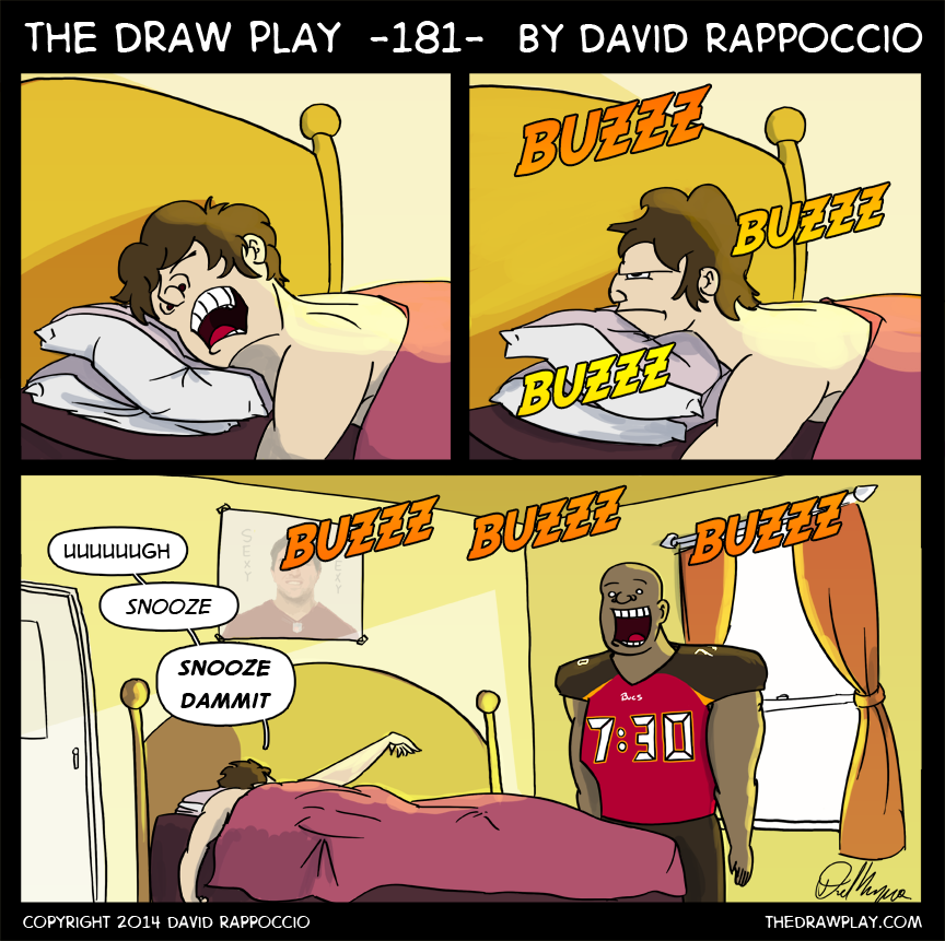
Wake up call
So, those new Bucs uniforms, eh?
As much as I love the helmet I’m a little disappointed in the re-designed uniforms. I wasn’t expecting a total overhaul like this, I was expecting minor tweaks. Overall, it’s kind of…eh. I want to see it in motion before I can really tell if it was a good idea.
One thing everyone seems to agree on though is those numbers were probably a bad idea. They look like an alarm clock digital font. The thing about this uniform to me is that it feels like they had a bunch of nice little ideas for tweaks to make things more modern, and used them all instead of finding which combo worked the best.
Different color shoulders. Okay, Titans do that, it could work.
Small orange highlights. Okay, bucs totally need more creamsicle.
Fancy numbers. Okay, whatever, Nike seems to like those sharp angles, why not.
Fancy material that shines on the numbers. Okay, kind of unnecessary, but might work.
But instead of finding which combo of these worked in tandem, they threw them all together in one package. I don’t think they all work together. A fellow on reddit going by _ThunderGunned_ made a few quick edits, eliminating the shoulder color changes: And I think it looks better. I saw other edits floating around that removed the Orange highlights, and ones that simply removed the lines on the numbers that make it look like digital numbers. Almost every minor edit I saw, which took away just one element of the new design, looked better than what we have. So that’s why I think it’s a case of Nike trying too many things at once. I don’t think the uniform is a disaster (although I hate the white away versions more, it makes the shoulders look really heavy) but I think it’s a little too far gone. If I had to have one change, take away those stupid lines on the numbers so it doesn’t look like my alarm clock.
But I thought the Seahawks uniforms were bad until I saw them in motion, so it’s hard to accurately judge them in these black voids they got photographed in. So I’m willing to give it time.


When I first saw the uniforms, the numbers is what I first looked at. When I saw them, I was like “Yeah…it ruined it.”. However, I like the entire thing, along with bringing back the creamsicle color.
Look on the bright side, this means that we’re going to get a great new look from Cleveland next year. Vikes had gorgeous unis, Dolphins had bleh. Bucs are bleh, so Cleveland is going to be sexier than Sexy Rexy.
The sad thing is that just adding Bucco Bruce would have made it all better IMO…
Hope there’s no powercuts at the RayJay. Penalties will be murder.
“Holding… Offense, number 88… No, that one there… No not him, *points* HIM…”
I disagree about the redesign of the colors; I actually really enjoy the color scheme. At first, I thought it looked putrid, but now it has grown on me. The numbers I think are far worse than what people are saying if that’s possible.
Lol I be all … wheres da bacon
You’re certainly no Vontaze.
get off ma boi raji
shut yo ass up bad andy sound like some bitchass vontae davis
You don’t get to talk shit until you win a playoff game, Andy. Even I have a playoff win.
andy lookin like some candy corn wit his white ass head and orange shouldas
I like the color scheme but the rest of it… Vile. The first thing I noticed about it was that it looked like a digital clock. It doesn’t flow well with the rest of the uniform. It’s horrible. I hope they don’t overhaul my team’s uniform like that.
That uniform looks like something from the Arena League.
They look like some kind of peanut butter candy. Anyway I think they look tasty.
I saw your mouth eyed pictures on profootballmock.com
Be grateful i didn’t intercept it/tip it to Sherm.