
Every Uniform Reveal Video Sucks
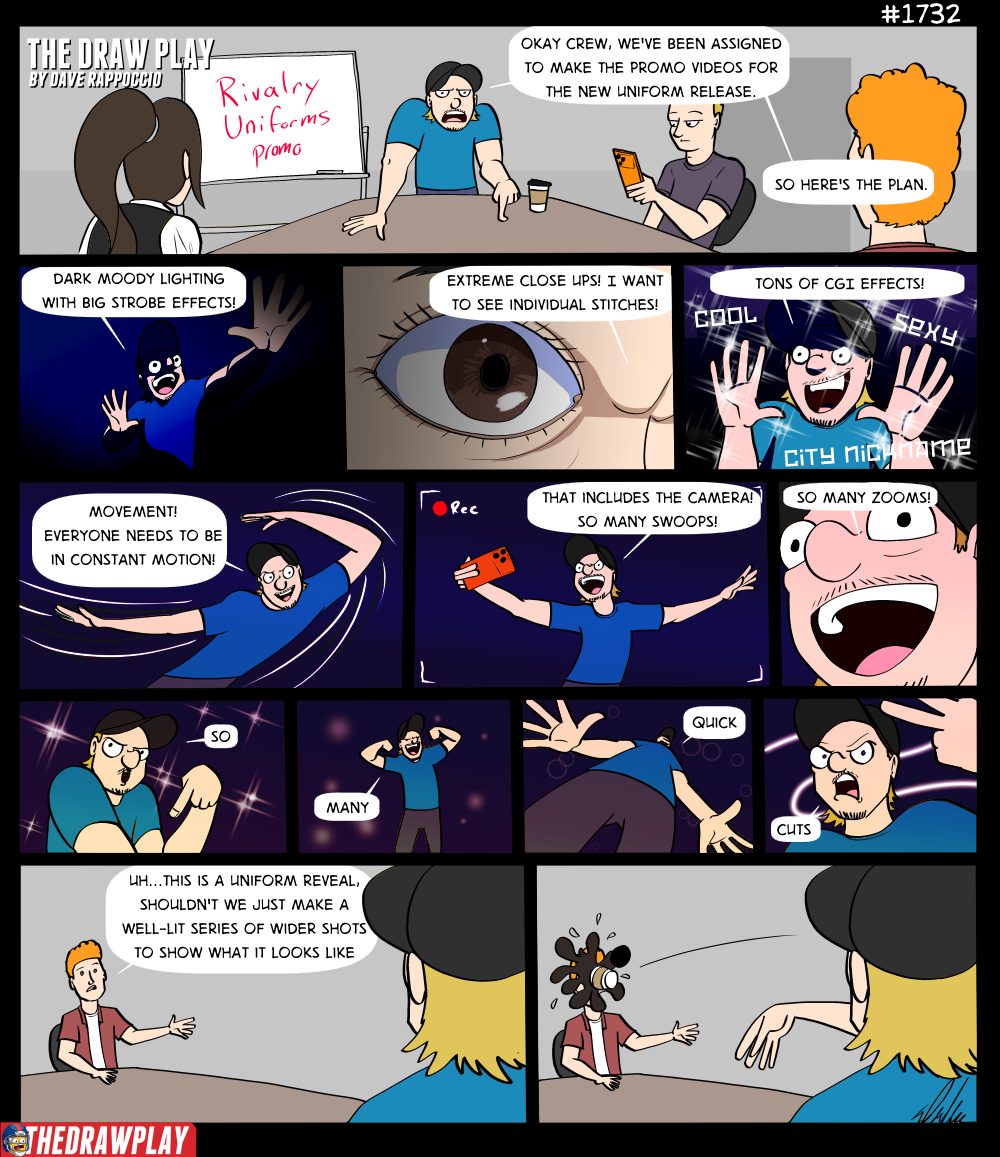
Yup, I made a uniform reveal comic that wasn’t my two goobers. Because for once something else has been pissing me off more.
The promos for these uniform reveals are shit. They are shit because they don’t actually show you anything except cool angles and neat lighting. You can watch the 2 minutes of the reveal video and come away still wondering what the uniform actually looks like. None of them just show the fucking uniform. It’s like the people behind the promos don’t want you to actually look at it so they throw every possible distraction method at you for hype.
To actually judge this new batch of uniforms I had to go to the webpage of every team and click through the galleries, because nothing they released on social media did a good job of actually showcasing the fucking things. At this point I’ll give extra points to the teams that did some promo wide shots in bright white light so I can view the styles.
Having actually gone through the full 8 uniforms, I will say one thing: I think this crop of uniforms is better than last year’s. Last year’s uniforms were mostly experiments that did not work. The Seahawks turned into the Oregon Ducks. Arizona looked like a tortilla. The Rams, 49ers, and Dolphins just made a black alt. The Pats used colors they don’t normally use, and the Jets were…just dull.
This year’s slate feels like they stayed closer to the teams actual look and color scheme and just varied it with different details. It works better. I don’t actually hate any of these.
THE MINNESOTA VIKINGS
Deducted points for no promo material with clear, non-colored or dynamic lighting, making judgement hard. From what I can judge, the purple is too Ravens for me to like, but everything besides that is good. I love the runes on the helmet. I like the pattern on the shoulders/helmet. The font is a bit goofy but it’s blocky so that’s good. These are fine.
THE GREEN BAY PACKERS
Bless you Packers for having some fucking clean promo shots so I can look at them in neutral lighting. A good idea too, because I liked them way more when I saw them without the fancy bullshit. I don’t like the font, round fancy serif fonts do not fit a football jersey. Outside that, the uniform is mostly just a more desaturated tone of their normal green uniforms with the white helmet. It feels like a good mix between the white-out uniform and the normal uniform. The Packers win by doing very little.
THE CHICAGO BEARS
Deducted points for no promo material with clear, non-colored or dynamic lighting, making judgment hard. We don’t actually get many promo shots, and they are all taken in sickeningly orange lighting, so they might look worse on the field. That aside, I don’t hate these either. The vertical stripes on the shoulders are a bit silly, and the high intensity of orange gives me Syracuse vibes, but that’s okay. Another acceptable uniform, imo.
THE DETROIT LIONS
They didn’t give me a white background but they gave me clear lighting, so that’s nice. Honestly, the Lions gotta stop making Panthers uniforms. The black alternate was a Panthers uniform. This is a Panthers uniform. They should not be allowed to do the black logo. It’s Panthers. Outside the Panthersness of it, I like these well enough. The actual Panthers should take notes.
THE INDIANAPOLIS COLTS
Deducted points for no promo material with clear, non-colored or dynamic lighting, making judgement hard. This is the worst promo of all the teams. The video is dimly lit with heavy blue, making the colors and details impossible to discern as intended. They barely give you any pictures; they are all shrouded in shadow, and the uniform is bland. It’s the closest we got to another Black Alt. The nicest thing I have to say about it is that it’s a better realized version of the terrible Indiana nights thing they did two years ago.
THE TENNESSEE TITANS
Deducted points for no promo material with clear, non-colored or dynamic lighting, making judgment hard. Outside the terrible presentation material, the Titans uniform is probably the most experimental of the group, and is honestly…good. I like it. I like that they finally leaned into the musical theme of Nashville with the guitar string stripes and the neon light style numbers. The helmet is gorgeous. But these might look like total butt once you get real lighting on them, the promo material is complete ass. Ironically the behind the scenes pictures give you a better glimpse at the uniform. This one will probably have the biggest divergence of opinion between defenders and haters.
THE HOUSTON TEXANS
First up, thank you Texans for properly lighting your promo material. I can see the product! Secondly, have you considered not being the Bills? You just made a Bills uniform. At least it’s a good Bills uniform. I like the subway tile motif.
THE JACKSONVILLE JAGUARS
The Jags with the cleanest, simplest, clearest picture of all. Thank you Jaguars. You just put them in front of me with no frills and let me look at you. That said I think this one is a miss. Something about the teal helmet on the white jersey and black pants makes the players look child-like. I really like the helmet solo, but as a combo, something just feels wrong. The jaguar print pant looks goofy and not committed enough to the bit. The font is too fancy. I want to love these, but they feel off.
On the whole though, this is a much better batch than anything from last year. No major backfired experiments & good color work (as far as some teams allow me to see it). I would consider these a major upgrade from last year.
Next year lets keep this quality and focus on giving us good promo material too.

The Titans kinda look like the Argos.
Tennessee goes back to the old Houston colours as their main look, then brings the navy straight on back anyway.
And ironically, Houston also goes Moon-era Houston adjacent.
Minnesota wins this one for me. That whole look is proper badass, leaning hard into their identity. Chicago & Green Bay look ancient, while Detroit looks like it just hit Shuffle. The carbon fibre detail is cool though.
Indy? Never got away with slab serif numbers like that. Definite swingandamiss there.
Jacksonville? OH Christ no. Another colour shuffle. Teal helm doesn’t work, the numbers feel more N’Awlins than NE Florida, the gold looks severely washed out, and those pants… egad. Tried to get clever hiding words in the pattern, but all that means is that anyone dedicated enough to finding them is going to be STARING DIRECTLY AND INTENTLY AT A PLAYER’S CROTCH.