
Alternative Options For Odell Beckham’s Logo
Nike recently filed a trademark on a new logo they’ve been working on for everyone’s favorite drama magnet! Here is the new logo for The Oregonian newspaper. I mean Odell Beckham Jr’s new logo.
It’s….eh. I’ve gone in pretty hard on player logos before, because the subject interests me, and this one is bleh. It’s okay. I don’t hate it. Honestly in one very specific way I appreciate it. It’s not quite the same old shit every other player logo seems to be. Not quite. Close…but not quite.
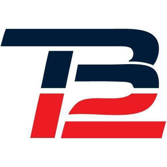
Every player logo that seems to come out is basically “COOL SPORTS FONT” of the player’s initials, with the player’s number worked in somewhere. Russell Wilson. RG3. TB12. The list goes on. None of them are egregious on their own, but the trend of having a personal brand like this is barely half a decade old and it’s already an obnoxious cliche. As far as Odell Backham’s logo goes…it’s not cool sports font! It doesn’t appear to incorporate his number! It’s just a single shape that is also his initials. It’s pretty close to RG3 if it’s close to anything. It’s…eh.
There’s also the issue of it looking like a classical letter head typeface from a newspaper or fancy old book. I give it some points for originality there, and the way they blended the 3 letters together is actually pretty damn solid (Better than RG3’s). But…why a classical typeface logo? My biggest problem here is a problem I have with most sports logos, but especially with this one: how does it represent the player in any way?
How does an old newspaper typeface represent Odell Beckham Jr? Is it a media reference? That’s all I got. It doesn’t seem to really have anything to do with Beckham as a player or brand at all. This is just…baffling. I don’t think old newspaper fonts when I think about Beckham. I think crazy catches. I think funky hair. I think dancing. I think drama. I think football. None of that is present here. Nothing is.
So I have taken it upon myself to offer Mr. Beckham some alternatives. A chance to be more unique. To have a logo that no one will confuse for the Oregonian. For this project I looked into what makes Beckham…Beckham. To many of us, OBJ already has a brand. It was up to me to capture it. Without further ado:

Our first logo is the control group. This is the COOL SPORTS FONT with NUMBER INCORPORATED logo. See? It is OBJ, but it’s also a 13! Do you get it? Do you? However, to add some personal spice, it resembles the old GIANTS logo. Odell Beckham is a player on the Giants, no matter what Adam Schefter wants to believe. So in many ways, this is more in tune with Odell’s brand.

Odell Beckham’s name starts with the letter O. He also has a distinct and funny look. For this logo I took an O and drew his face. Pretty simple and straightforward. Simplicity is key.

Odell Beckham is famous for getting in a fight with a kicking net and losing. Then proceeding to piss off all his haters by leaning into the gag and owning it, celebrating with the net and further annoying everyone who already hated him. He ultimately made peace with the net, and this logo brings that together. No other player has had this effect, it is distinctly Beckham. I would wear this on a shirt. So would you, you capitalist slave. Your self worth is nothing without this shirt. Pay me.
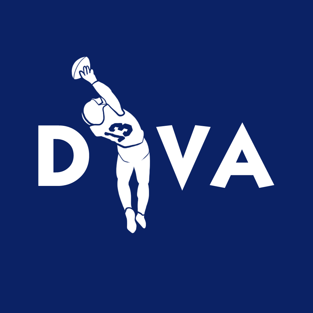
Beckham is the image of a Diva WR. Outside the fact that he’s a fantastic teammate, something that his detractors routinely seem to forget. However his high profile antics on the field and off the field have given him a deserved reputation. This logo is meant to join the two elements of OBJ’s existence into a cohesive whole. The DIVA part is clear. But by replacing the I with an image of his most famous achievement, it reminds us that despite his antics, the talent remains worth the price. The good…and the bad…together at last.
In this logo, Beckham is peeing on a fancy font of his own name. This represents how he is defying the norm. Defying how crusty old butterballs demand he act. Beckham, as pictured in the logo, is above all that. He is laying waste to your preconceptions of what he should be. To the people demanding he be put in his place: prepare to have pee in your face.

No other logo truly captures the burden of being Odell Beckham like this Atlas logo. Odell is burdened with expectations. Burdened with hate. Burdened in ways we cannot fully understand. At yet he persists, carrying these burdens like a champion. It also represents how he carries the entire offense on his back.
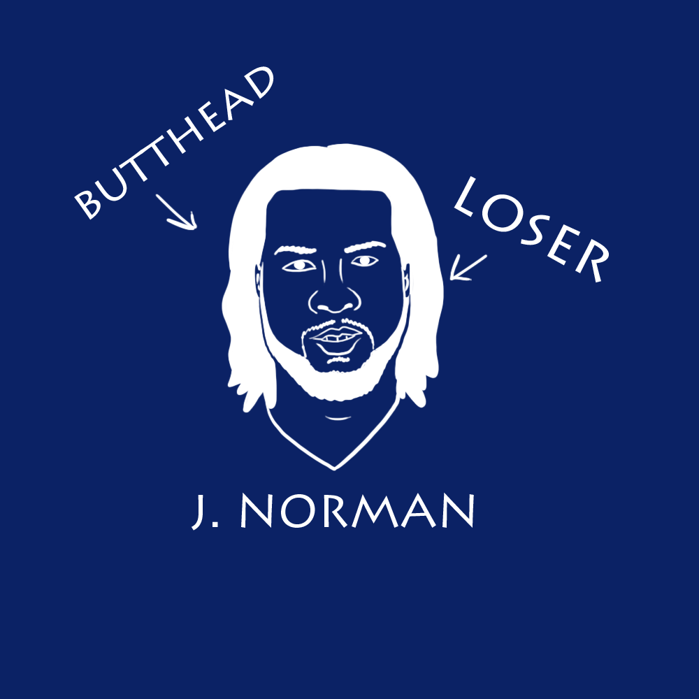
Josh Norman is a total bitch and DESERVED to get speared. The Josh Norman incident is also either the biggest or second biggest single moment that his haters use as a starting point for hating him. If you hated Odell Beckham, this moment is the fuel you use to light your eternal flame of misjudgement. Why do you misjudge Beckham? Because Josh Norman is a total bitch and totally deserved it.

If you are going to be a drama magnet, you may as well own that shit, amirite?
Hit me up, Becky! I’m open to taking royalties. Make me your publicist!

His logo kinda reminds me of how Toyota manages to fit “Toyota” in their logo except OBJ’s is done with horrible execution. They missed an opportunity to somehow incorporate “13” in a creative way
His logo kinda reminds me of how Toyota manages to fit “Toyota” in their logo except OBJ’s is done with horrible execution. They missed an opportunity to somehow incorporate “13” in a creative way
I hate OBJ
One of the best sports related logos has to be Scott Van Pelt. It’s simple, iconic and well executed. Every logo should strive to hit those marks. I think the first Dave logo hits that mark and I love it.
Uh, y’all’s? There is a 13 in his new logo. Look at the j and the b part of the shape. It makes a 13. That’s why the j is in the middle. Because it with the b part of the shape, make a 13.
shit, that Giants one is…really good
I actually really like the one based on the old Giants logo, is that wrong?
Obj wishes he was Antonio Brown or Julio jones . He even wants to be a.j. Green.
That net logo is fire and I would wear it on a shirt.
Wow… the ACTUAL OBJ logo kinda sucks. As for these, I really like the first plain OBJ one, as well as the diva one.
Is it me or does it feel like they just tried every font in Ms word and got to Old English and were like YOLO.
I think it’d be great if OBJ did the DIVA logo. I always think that a player owning his criticisms is cool.
Being mad about player logos is like being mad that the Tampa Bay Bucs uniform doesn’t make then look like pirates.
I think OBJ’s nike logo incorporates his number 13 using the J and B.
I predict that it is more likely that the Giant’s GM Dave Gettleman will either Trade or Cut Odell before giving him the Contract that he is seeking.
Nice logos!
I will forever think of OBJ as “Hole-dell Beckam” in remembrance of the time he got so mad after the Giants shit the bed against the Packers in the playoffs (the year of the infamously overhyped boat photo), that he punched a hole in the wall on his way back to the Lambeau Field locker room.
You could do a logo that uses the hole as the “O”.