
Now for my favorite of the 4 major updates: Houston.
One of the advantages Houston has is that it has no “classic” uniform. They have only existed for just over 20 years and have kept the same uniform the entire time, making the previous iteration the de-facto “classic” that I assume they will return to in 10 years. But that frees them up to try things in the meantime for a new era, and the first attempt? I think it works!
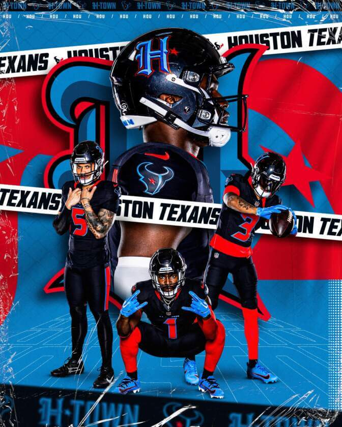
This is a pretty big overhaul with a lot to mention. I’m going to start by getting maybe my most controversial take out of the way: I think the Texans should make the Battle Red uniforms the primary. Give up the dark blue scheme and go hard into the battle red look. I love the battle reds. Now I do think the full red set should be more broken up with either blue or white pants/socks (NO MORE ONESIES) but I prefer that red uniform so much more than the fairly boring “Steel blue” they use as a primary. Also, the new red helmet with the horn? Chef’s kiss. I do wish the horn was a little more visible, but I think it rules. But hey, if this is going to be an alternate fun uniform, I dig it. I dig it a lot. Bring the horn onto the regular helmets to add to the Horny Gang with the Rams and Vikings and I would be ecstatic.
The big element change to the new uniforms that I saw get a mixed response: the shoulder horns. I fucking love it. I love it more and more as I look at it. It fits the team theme, it’s unique, and it’s not that intrusive, I love it. I love it so much that I’m actively mad they omitted it from the home uniforms. Why? Put a white horn on the home uniform too! It will give both the home/away/alternate uniforms some much-needed synergy. Far too many modern uniforms have the problem where the away uniform doesn’t feel like it matches the home uniform. Stop that. If one uniform has a unique standout design element, put it on the other! That’s identity!
Outside the lack of horny, the home uniforms are still pretty solid. I like the collar stripe. Unfortunately without the horns or a shoulder element of any kind, it just kind of looks like a black alternate jersey. Thankfully it’s not full black so it lessens the blow somewhat.
The site I’ve been linking to for most of these redesign compilations, Uniwatch (A great site), doesn’t like the font for the numbers. I don’t mind it. The Texans have always had a slightly dumb font with curves in odd places. It doesn’t bother me much. It’s still blocky and readable. Houston also has the team name written above the numbers. It’s closer to the Broncos than Jets or Lions in offensiveness, but it could still be done away with.
Now for the big special alternate: the H-Town color rush alternate. I adore the H logo. I don’t like the rest of it.
I would genuinely love if Houston ditched the boring bull logo and adopted the H-Town logo as the primary logo instead. I love how fancy the font is. I love the color scheme for it. It even looks good against that dark helmet, good enough that if they didn’t use the horns it would still be preferred to the bull head logo. The H logo is perfect. PERFECT.
The rest not so much. Before I tear into the color problems, I want to address that this probably wasn’t the original plan. The original plan was probably something closer to the Oilers, with the light blue as a primary. But, as some of you know, the Tennessee Titans are a bunch of petty bitches who think they own the color Columbia Blue. Fuck off, Titans. You can’t copyright a color. The Titans don’t even use Columbia Blue anymore, they switched up the shade for their new uniforms. According to the team, they originally weren’t even going to use Columbia Blue in an effort to avoid the copyright fight, but they still got pushback for it. Why? WHY? WHO CARES? LET HOUSTON USE WHATEVER BLUE THEY WANT, ITS A BLUE. NOBODY OWNS BLUE. YOU DID NOT INVENT A NEW COLOR ON THE SPECTRUM THAT YOU NOW OWN, YOU CANNOT COPYRIGHT BLUE. This is ridiculous. The Titans would only have a case here if Houston used every color from the Oilers rights, including the logo, and then just made the Oilers uniforms and called that the alternate. That would be a copyright problem. Not using the same shade of blue for a completely new look. Eat my ass, Titans.
The resulting uniform is a compromised mess that doesn’t work for me. While I obviously love the helmet with the new H logo on it, the red is alarming against the dark blue jersey. I feel like I can’t look directly at the bright red numbers. It might look less reflective and oppressive under standard gameday lighting on TV and I hope it does. There is too much red and the contrast doesn’t work for me the way it does in reverse on the battle red uniforms. Part of this might be due to the blue outlines on the numbers. The already emergency level red is outlined by the bright light blue, and the two colors just don’t work well in that fashion. The H logo has them in reverse, with the more calming blue as the primary with the red as the outline, and that balance is more effective. The light calming blue just doesn’t do enough to calm the emergency red. I’d have preferred no light blue or red at all instead. I also hate the Texans current bull logo with the blue instead of white, looks bad. It reminds me of when the NFL outlined everything in pink for breast cancer month, just with blue. The logo looks bad with blue instead of white.
In short: A good update. The H-Town is a compromised mess with one extremely good idea on it, the battle red alternate is mostly great, the home and away uniforms are still fairly safe but competent upgrades. Good job, Houston. Keep cooking. Someone go punch the Titans in the nuts.
Thank you for reading the same joke 5 times. No comic on Monday, I will be traveling on Sunday and won’t have time.
