
The Broncos Get Bumpy
Out of the 4 major updates, the Broncos update is my least favorite.
I didn’t think the Broncos needed an update in the first place but apparently a lot of fans did for whatever reason. The result? Modernity, but lame.
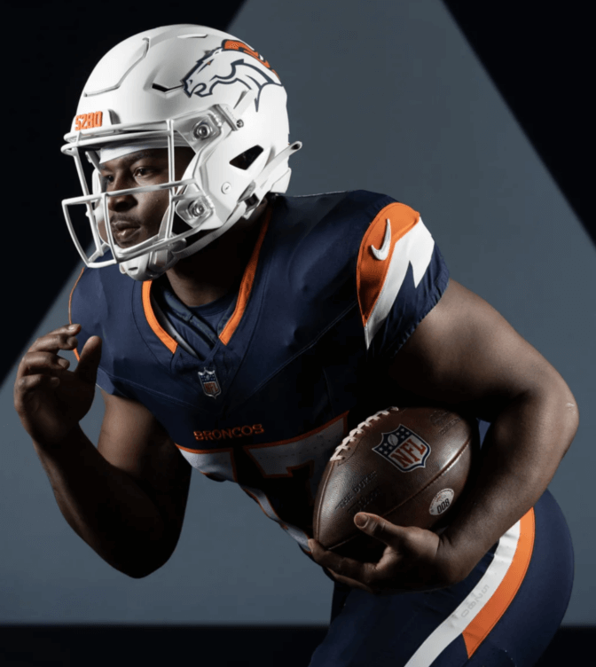
My first thought on seeing the new uniforms was “why did they give the Broncos a Chargers-esque shoulder stripe”. The little jagged cut in the middle of the shoulder pad looked like the Chargers bolt for a second. I should not be thinking about a division rival for your new uniform. Upon further inspection, the shoulder is a simple graphical representation of a mountain, which makes it more forgivable, but then it stops being a mistake and turns into a sub-par execution of a neat idea. The fact that it doesn’t immediately register as a mountain to a lot of people is a problem. It should be obvious. It might have worked better if it more resembled a range of mountain peaks or if the mountain color extended all the way to the bottom of the sleeve instead of effectively being a stripe. As it stands, it’s a boring execution of a nice idea and it leaves a lot wanting.
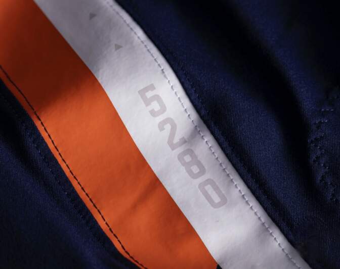
But in general this new design is full of strange ideas. The biggest one is the tiny little mountains all over it. Why? One: they won’t be very visible on TV, so what’s the point. Two: if they were, it would look even worse. Why do the numbers need texture? Three: the number texture isn’t even the biggest laugher: they put triangles in the armpits. What the hell? When they aren’t covered they will just make no sense. It’s like a designer looked at the uniform and was bothered by the negative space and just had to put something there. Here you go, 3 tiny triangles. Looks stupid as hell. If you are going to put tiny details on your uniform that wont be visible on TV, put them in places that make sense, like in the collars. The Broncos also have the number 5280 (the elevation of Denver) written in the stripes and on the helmet front. That works just fine as a hidden element. A bunch of triangles randomly in the armpit? Not so much.
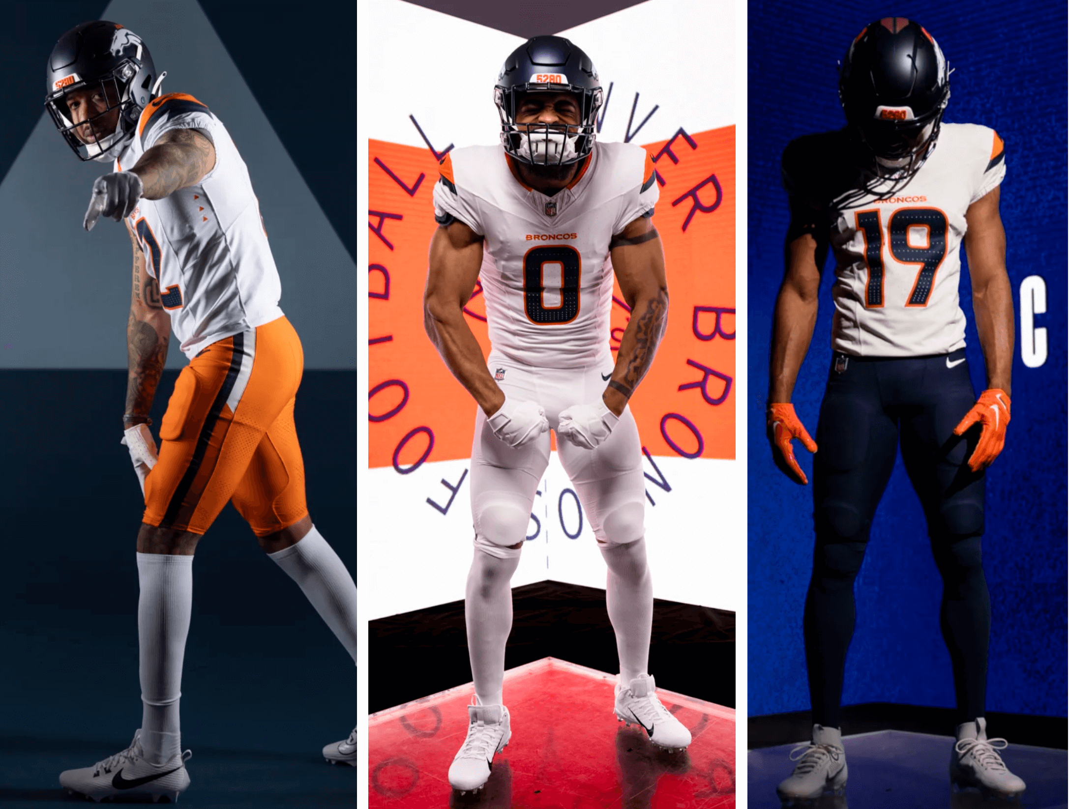
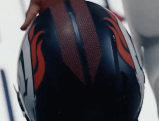
They ruined the helmet. If you like matte finishes (I don’t, like like my helmets shiny) then the new look will satisfy you. But they removed the middle stripe and I am mad about it. The middle stripe was unique among the NFL and it was designed to resemble the beginning of a horse’s mane. I loved that. They replaced this cool and good element with what looks like faint racing stripes? Bleh. Give me my mane back.
The uniform also has the team name written over the numbers but it works better here. The word Broncos is still small and the Broncos already use a curvier, skinnier font than most teams so I’m not bothered by it as much as I usually am. They also made the alternate white helmet official, which is fine by me, I actually like the white Broncos helmet and I think it works.
All in all, not really an upgrade. I don’t despise it, but I don’t care for it. It still reaches higher highs than the Bucs alarm clock jersey (The worst thing Nike has ever done) and it’s still better than the worst current jersey (The Rams modern atrocities). The orange/white/navy blue color scheme is still solid and hard to completely fuck up. I will say something in the Broncos favor: they didn’t make a fucking black alternate. We got a Navy jersey, a white jersey, and an Orange jersey, with mix-matchable pant flavors of the same colors. That’s fine by me.
The throwbacks are fire of course but the old sneezing horse D logo is leagues better than the angry animal head and the lighter shade of blue is also nicer than the navy. As much as I like it, I’m fine with them keeping as an alternate nod to the past. At least the Broncos tried something new here instead of just aping nostalgia points like the Jets.

Maybe it’s just homerism for me but I really like the redesign. I never saw the lightning bolt that you claim, it always registered as a mountain for me – maybe because I’m used to the Rockies logo which features a stylized mountain? I think the only thing I agree with you on is the fact that a lot of the details seem pointless because they won’t be seen – but I’ll wait til I see them in motion on camera to judge. Maybe they’ll turn out to be one of those things where you don’t necessarily see THEM but they add up to something and if they were missing, you’d notice their absence. Or maybe they’re just a cynical ploy to shift more jerseys by adding details for the fans to enjoy in person.
I can’t stand the triangles. I’m 100% convinced the dumb triangle are Nike’s way of combating knock-off Chinese jerseys.
We were in need of an update because we haven’t changed the unis since 1997. The fans wanted the throwbacks or at the very least the Color Rush jerseys with white striped pants but we got the middest unis because we’re owned by Wal-Mart.
For instance, here’s a modern retro redesign by a Madden modder that looks ten times better and closer to what the fans wanted in the rebrand: https://imgur.com/a/XbTfRvG
I mean it’s not that bad but I like the throwback alternate but the home is neat and they tried something great idea mediocre execution. Not as good as their very first uniforms (you know what I’m talking about).
Hear me out. The rams jerseys just need to make the alternate white their away and make the numbers plain yellow with no reflective thing. I have an Arron Donald Home jersey and personally think it’s really cool. Just hate the away piss stream what where they thinking. Just make it simple with a modern twist like they did with their alternate. Home easy fix, Normal numbers. Make the alt the away jersey and make a navy blue throwback.
Tomorrow we hear about the Texans black alt (that or it is a really dark blue I couldn’t tell). Why so many black alt’s?
I hate matte finish helmets with the fire of a thousand suns. I’d take every team in the league going with non-team-color all-black uniforms before a single matte helmet (or the even uglier “matte finish automobile”, but that’s not relevant here). I’d prefer the Bucs alarm clock jerseys a billion times more than matte finish helmets.
Other than that, I don’t have much to say about matte finish though 😉
Nike hit a hole in one back in 2012 with the Seahawks jerseys and they’ve been chasing that high ever since.
100% on the money.
Separately, Broncos jerseys look too much like they could be a new design for the Browns.
I’m a lifelong Broncos fan. I feel like the fanbase has been screeching for a return to royal blue and the D logo for years now and they come up with… this. I cannot express how much I hate these uniforms. I hope they get rid of these asap and either just make the throwbacks permanent or modernize the 80s uniforms.
I feel like of all the redesigns, this one had the best concept. They clearly put a lot of thought into the layering of colors, the use of abstracted mountain shapes, the bronco head motifs (which I’m charitably attributing to those chargers-looking zig zags.) There’s a lot of clever thoughts, but it feels like they didn’t step back and look at the whole. The pants work really well imo, but they overthought the rest.
The colors rock. I like that they made them a little dustier, but kept them nice and lush. That blue in particular is really really nice. The white helmet thought….don’t love that. The navy is already really nice in matte, the white helmets are just so obnoxiously bleached and punchy when the rest of the colors are so lush and understated.
can I just say, Dave, as a design professional I LOVE this series. I love getting to read the thoughts of someone who has some artistic sense because most people writing about unis just don’t quite know how to articulate what they’re looking at. Thanks, man!
The new Rams uniforms didn’t really sit well with me (as a Rams fan that buys a ton of merch) until I saw them in person. They pop on the field and the big numbers made it really easy to identify everyone (the HS football announcer in me notices that). Now, I love them. Especially when they introduced the white (still don’t like the bone).
Am I the only one who doesn’t like the classic throwback look as much as the modern color scheme? I think it’s a clearly dated look which belongs exactly where it is: as a throwback