
NFL On Fox Makes QBs Buff
Every season you see the major networks alter their graphics and presentation a bit. Sometimes the changes are minor, sometimes they are a pretty large overhaul. Fox seems like they recently went for the large overhaul. They have a new score graphic that is absolutely outstanding in it’s placement and simplicity. Seriously, look how clean and perfect it looks. It isn’t fancy, doesn’t have a ton of bells and whistles, and looks honestly perfect. They’ve also started doing extremely short comedy skits in commercial bumpers before halftime. These are universally complete garbage and when I see their pathetic attempt to make me giggle I want to find the writer to these shows and uppercut their solar plexus.
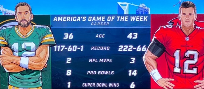
But the new aspect to Fox’s presentation that has garnered the most discussion is the player graphics. Instead of using a normal photoshopped cutout or greenscreen graphic video of the player that they can throw next to stats or presentation material, they elected a more unique route. They are using artwork. They are essentially just traced versions of actual QB promo photos, but they went the extra step to make them art. This honestly is kinda nice. There are just two major problems with the drawings:
1 – I was not the person contracted to make them
2 – They are all hilariously buff
Tom Brady does not have biceps larger than his head. Philip Rivers is not sculpted like DK Metcalf. Taysom Hill does not throw the football. The inaccuracies just pile up.
I found most of these renditions amusing but not particularly awful. Fox may have had to make these artwork pieces because they probably couldn’t get the players in for promo material in the age of social distancing and covid precautions, so they decided to get creative and likely get someone in the art department to churn out these works. That’s why they are clearly just explicit almost traced copies of actual promo photos. They obviously aren’t actually traced, because again, Tom Brady does not have arms bigger than his head. But the artist likely used the old promo material as a base for turning them all into beefcakes.
I think the Rivers pic broke me though, and might be the worst one. The longer you look at it, the less sense it makes. His broad shoulder sleeves imply the existence of shoulderpads. Yet his massive round pecs imply he is just stacked instead. Worst of all, his jersey becomes body paint down his torso. Instead of falling loosely over the top of the pants, the way a jersey does, because it is a loose, large shirt designed to fall that way even when properly tucked in, Rivers’ jersey simply becomes abs. Nobody’s jersey is tight enough to perfectly form around their abs. Not even the players with massive abs (DK Metcalf) have tight enough jerseys to show that off. I can forgive beefy arms. I can’t fathom why the artist turned a loose jersey into under armor, especially on a player like Rivers. In the entire NFL, only Ben Roethlisberger probably has more of a dad-bod than Philip.
The drawings are honestly fine, they are a bit too safe but Fox wasn’t going to have cartoons with any edge for their football broadcasts. I just can’t get over Rivers Abs. What a weird artistic choice.

A part of me hoped that the kid would be Jacob Eason
I wish networks would move their graphics back to the upper left. At the bottom center, it sometimes covers the action if the camera person is zoomed in on a lot of action
Agreed. Fox had the best look from 1998-2000. Simple, non intrusive
Hahahaha, oh this is really odd but I can’t look away. Why do I want more of this? May I suggest a ripped Kermit Mahomes or BoJohn Elway. Or go for the gold with a ripped Aikman/Buck combo.
Ohh god no! It’s Fox so you just know they’d give Joe Buck’s goatee some stonk abs.
Heh heh, to add to your nightmare, ripped Erin Andrews reporting on the sideline, and from the studio, a massively beefed up Mike Pereira predicts the call will be overturned. Coming up at halftime, Curt Menefee and Terry Bradshaw flex their pecs, will get to the scores and highlights if there’s time.
Okay but has anybody noticed how terrible the MNF graphics are i mean Jesus Christ John Elway and dancing dragon Joe Flacco to name for god’s sake ab’s rivers haunts my dreams and the fox touchdown graphic that has the player next to it is ridiculous that should only be used for the Superbowl This is why CBS is superior the commentators are good and fun and the graphics are cool and simple.
Hard disagree, the silly 3d graphics are the best part of Monday Night Football, they are so stupid and goofy that they come full circle into being hilarious and wonderful and I’m happy to see them leaning into them
but why
Who wants to make drug side effects into national television
Still nowhere near as crazy as other stuff like animations MNF has had for years, or the Bradford head photoshopping incident a few years back
I’m half-surprised that Fox doesn’t repurpose old crowd reaction shots from The Masked Singer on its NFL broadcasts…
I have never watched the Masked Singer and the commercials every week have convinced me to go to LA and burn down the studio
The world would certainly be a better place if you did.
Unlike most other talent competition shows, The Masked Singer continues to use crowd reaction shots even though the show is no longer actually shot in front of a crowd. Meaning… some poor person’s job is to sift through old crowd reaction clips and match them up with the director’s notes, which I imagine are things like: “Find a middle-aged couple nodding in agreement with Robin Thicke.” “We need a shot of 3-4 young friends who look like they could be dancing to a middling cover of ‘Flagpole Sitta’.” “Get a clip of two female friends cackling to go with Ken Jeong’s latest idiotic guess.” To me this is both hilarious and incredibly sad at the same time.
My problem with the Fox score graphic is the timeouts. For some teams, the shading between having a timeout and not having a timeout is too subtle. You can’t tell if they have 3 left or zero.
Some of the pictures have rly funky poses too.
Have you seen Drew Brees criminal portrait?
https://twitter.com/FalcoholicMatt/status/1328084165997293570
“These are universally complete garbage and when I see their pathetic attempt to make me giggle I want to find the writer to these shows and uppercut their solar plexus.”
As a writer myself, I must implore you not to blame the poor saps that have to come up with those skits. Trust me it is not what they thought they would be doing with their talents. Imagine you are contracted to come up with an ‘X-Treme’ logo for a cereal brand, and then people judged your merits as an artist off of that. These guys are hamstrung from doing anything good by the demands of the NFL, the demands of the Network, and the ‘talent’ that will be performing the skits.
Also, how are you uppercutting a solar plexus? You know what both of those things are right? I mean I guess if the person is already hunched over you could…
From what I can tell, I think that they were trying to go the comic book route and make these players look like Super Heroes. That’s the only real explanation I can come up with for why they made every player look so unnaturally buff. Definitely a weird artistic choice though, but I guess it fits with the new TD graphic they have.
I totally agree with you on the new Fox graphics. They finally hit after years of just being okay at best, and I’d say literally anything is an upgrade over what they were using last season.
I can’t be the only one who thought of this: https://media.comicbook.com/2020/03/captain-america-rob-liefeld-1212562.jpeg?auto=webp&width=454&height=610&crop=454:610,smart
One of the stations (can’t remember which one) now has a little football next to the score of the team on offense. When it’s the team on the left side the little football looks like a minus sign.
The first game I saw this year with that graphic showed a score of -17 to 24 and for about ten seconds I actually considered that the rules committee must have made some massive changes during the off season.
Taysom Hills position is qb.
You’re so close to getting the joke, you’re almost there
He almost never plays QB though, IDIOT
he lined up at qb yesterday also yeah I died at the rivers picture
Almost, are you stupid
Dave, draw a picture of Eli in the Fox style
good thing he retired early enough
not a bad idea, HEROIC CHECKDOWNS, brian urlacher as the thing etc
The need to come up with an alternative to the promo shots reminded me of something I could swear happened in the 90’s. There was a team one year (I think it was the Broncos) whose Defensive Line for some reason refused to pose for those promo photos. I think on MNF they opted to just put in random joke photos (like drawings of Popeye) to get around it.
you might have to do a cardinals bandwagon fan comic, cuz brother, i’m halfway there. i just watched TNF and goddamn if my sphincter didn’t clasp for kyler and the kards in the last frame. really felt like they might pull it off. recency bias, perhaps.
fukkit, the kardz are my NFC team for this year. i hope the bucs lose to them
It’s Christopher Walken