
JJ Watt’s New Logo Is Bad
Early statement: I know I rip on JJ Watt a lot on here but I really do want to stress that I don’t hate him or anything, I just find his goody two shoes robotic #brand machine kind of exhausting. He seems like a really great guy; he sets a wonderful example for the children with his personality and it seems like he really helps out in the community. It’s telling that the only real reason people can come up with to knock him is basically that he’s too perfect. So I don’t hate JJ Watt, he’s just the sort of fun personality that is ripe for ripping on. Also, his new logo is bad. It’s pretty damn bad.
From a graphic design/artist standpoint I kind of hate it. It’s not necessarily a bad logo, it’s just a bad logo for what he’s going for. It looks like an extreme energy drink logo (EXTRA WATTAGE, NO CRASH! drink it now!). It looks like it should be the logo of the “evil” faction in a command and conquer game. It looks like a Battlebots logo. It’s got early 2000’s EXTREME angles on it (It didn’t need to be angled like that) and I hate the big pointy serifs on the wrong spot of the letter. Now that I think about it though, a Battlebot would be a pretty great way to describe JJ Watt, in both a positive and negative light. The reasoning behind the logo is okay, but it doesn’t come through in the design. It looks like two J’s back to back, so one is vaguely an L. It also looks like a W, sort of. This part is okay, I think it’s easy enough to see that. But then he claims that it also resembles a 99 when turned upside down, for his jersey number.
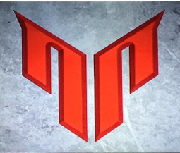
Uh, no it doesn’t. It looks like an N and maybe a P. I’d say upside down it resembles more of a spaceship of sorts, or even a penis. I can see a penis more than I see 99. Maybe that says something more about me, but if you are going to claim that’s a 99, then it’s also a dick. Lastly, JJ claims it’s supposed to resemble two buildings rising up to represent his work ethic. Symbols and logos in art can get rather abstract with how they represent things sometimes (interpreting that stuff is half the fun in art) but even for me, a total creative mind who has a big imagination and sees things like dicks in everything, I have to stretch to my absolute limit to see the “buildings” he’s talking about here. This logo isn’t terrible, it just feels like an early draft of a much better logo. Like he took the graphic designer’s rejected versions and said “actually no, I like that one” and the graphic designer died a little inside as he had to scrap a much better idea.
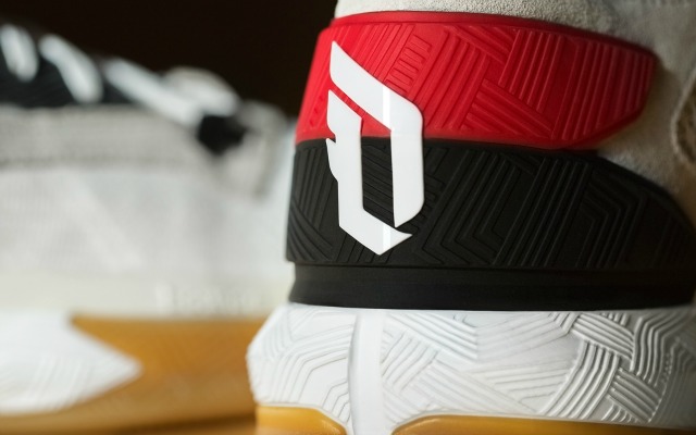
I don’t really blame JJ Watt for this. To be honest, he probably had very little to do with it. Dude is a corporate brand machine, I bet he had his agent or publicist farm this out to some low graphic designer and what we got is a vaguely stupid experiment in typography. This is hardly unique to JJ, this is a major problem across all of sports figures. Almost every sports figure good enough to have his own “logo” has some version of the same problem: It’s an overdone typography experiment. It’s some form of their initials or number. RG3’s logo is just the characters R, G and 3. Lebron James has an L and a J with a crown. Damian Lillard is a D, L, a 0 (his number). Tom Brady’s logo is a goddamn hideous mess of letters and numbers. None of these logos are particularly iconic. None of them actually create something really unique. Only Lillard’s kind of works because it’s more contained into a single symbol. They are all just EXTREME typography, and as a consequence, really boring. Look at the logos in the NFL with words, and look how simple those letters are, or how the letters are part of a larger design. NY is just a simple, straightforward NY. 49ers are just an SF in a circle. KC is two letters in an arrowhead. Chicago is a big, simple C. Green Bay is a big G. No Bs in there, no fancy fonts or CRAZY ANGLES, just a goddamn G, as easy to read as possible.
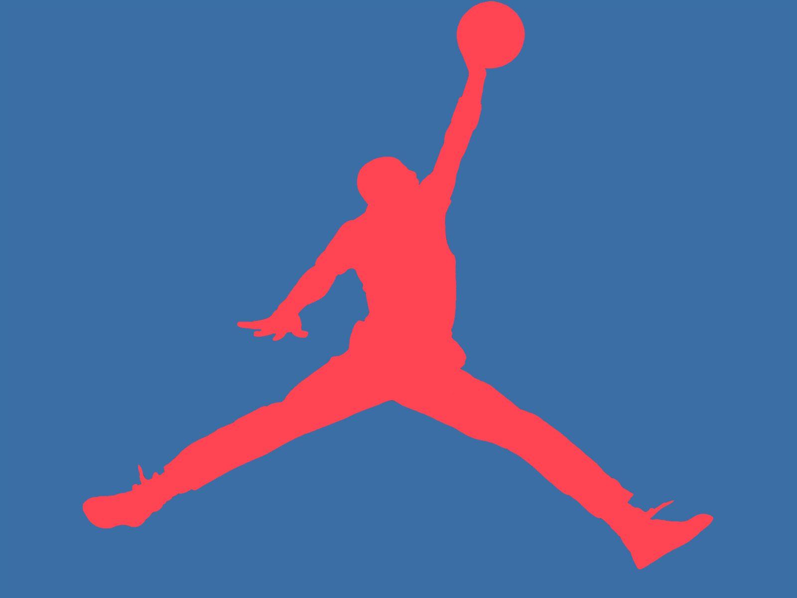
You know what player logo I like? Derrick Rose. It’s more than just a letter. We also all rightly praise the Jumpman for Michael Jordan. Guess what isn’t in that logo at all: typography bullshit. I wish more athletes would try to come up with something more interesting than typography with their initials. Want to see the absolute worst player logo I’ve ever seen? Russell Westbrook. What the hell even is that?
IN OTHER NEWS WE HAVE A GREAT NEW PODCAST FOR YOU. I got none other than PFTCommenter on the cast and we chat about JJ’s logo, Joe Flacco’s elite status, how internet porn has ruined millennials, and gritty chain restaurants.

That Russell Westbrook logo gives me a migraine
Seriously. Your eyes don’t know what to focus on.
I reckon most of the typography logos are based on people trying to emulate Tiger Woods’s design but missing the simplicity factor.
Maybe it’s just because Marshawn Lynch is such an interesting person to me, but i like his Beast Mode logo.
Also DeAnthony Thomas has a similar logo for his brand DAT.
Looks like a penis. Both the ailen and the logo
Checks out:
http://i.imgur.com/yaHnza5.jpg
Oh my fucking god lol
Nonsense. Upside down it looks like The Ultimate Warrior: https://www.youtube.com/watch?v=VkEl_R0dTfY
A lot of these logos look like things people make when they’re just starting to get into Photoshop and graphic design. Not bad for some introductory creations because it shows you’re getting the creative juices flowing, but not good enough to be official logos.
Nike and Michael Jordan proved that simplicity is beautiful when it comes to logos and the fewer letters or numbers you have to use, the better.
Is squirrel boning still going to be a thing?
Consider your life and why this question has been asked
I’m naming the squirrels ‘rexy’ and ‘cannon’
Pls don’t turn dave into a furfag
Dave, have you seen Zootopia yet, and if so what was your opinion of it? This is very important now.
It was a good movie. A touch overrated. Shakira Gazelle was creepy and I am 100% sure people on the internet have masturbated to her
Goddamnit I draw squirrels doin it a couple of times and now everyone can’t stop talking about it
I stared at Tom Brady’s logo for more than a minute, and I still don’t know what the hell I’m looking at.
If you look at the top 3/4 of it you can see TB, if you look at the bottom 3/4 of it you can see 12.
You would think that in the future, nobody would need a camera on their phone, let alone an actual camera.
That alien should be taking a photo with his eye
Of the logos linked, Rose’s is best, followed by Lillard, then RG3. The rest are ridonkulously overdone, bafflingly abstract or excessively bandwagony.
Damm, that JJ Watt logo rant was as long as one of my arena football recaps. Speaking of which…
The most boring game from last week saw the Portland Steel go into LA winless and head home winless as they lost 52-44 to the KISS’s backup qb. Portland is so boring and forgettable I’m not even sure they actually exist, kinda like the Titans. The Steel are 0-8; LA is 4-4
Game 2 saw GODDAMM JOE HILLS. He used to play for tampa before taking his talents to J’Ville, extending his TD streak to 60 games carrying the Sharks to a huge, coach saving win over the Orlando Predators with his 8 TD CATCHES in a 59-56 won that was made closer by Orlando’s garbage time magic as Orlando loses a big game in embarrassing fashion (despite the score being close). J’ville is 4-4; Orlando is 7-2.
Game 3 saw GODDAMM GENO SMITH THE LINEBACKER. Cleveland is now 4-0 since Arvill Nelson became the starting qb as he led the Gladiators to an upset victory over the Philly Soul, who probably overlooked the Gladiators to prepare for J’ville this upcoming week, even though the win would have given them a 1 game lead over Orlando (Philly owns the tie-breaker). When I talked about Geno Smith not being able to lead the Jets on Tuesday, I meant not like Arvill Nelson has overthrown all recievers in his path to lead Cleveland on a path to greatness (5-4 now; calling 12-4 on the year).
Next comment will be that song I promised you
Here’s my song (based off of a Christmas classic)
On the 5th day of summer, Tampa Bay gives to me:
5 T.T. TOLIVER TOUCHDOWNS
4 Epic Quarters
3 seconds left
2 interceptions
And the first win of 2016.
Tampa beat the Rattlers, THE RATTLERS! Tampa came back with 10 minutes left down 48-34 to win 63-56. T.T. Tolliver got his 100th touchdown with the storm (he already had 100+ with Orlando), but 101 was the game winner with 3 seconds left. I literally ran outside screaming ‘WE FINALLY WON. TAMPA BAY BEAT ARIZONA, STORM WINNNN” when he made that carch. Jason Boltus threw 0, zero, zilch, nada picks. 6-time all-Arena qb Nick Davila threw 2 picks. R.I.P. Rattlers dynasty (2011-2016). Tampa is 1-7.
Is the Alien wearing an Indiana Jones hat?
JJ Watt is a Gary Stu created by an NFL beat writer who’s also low-key racist.
So every white guy over the age of 50 (I’m white too)
SO DO YOU!
Do I get a prize for getting the alt text?
RG3’s logo is better.
Week 10 previews for arena ball:
The hottest team in the league, 5-4 Cleveland plays in their last home game of the season (the rest are road because of the Donald Trump coronation), while the 6-3 dead rattles from Zona are coming to town. I’ve got Geno Smith the linebacker going all the way to 12-4 (fuck it, ALL HAIL GENO SMITH THE LINEBACKER). Tomorrow night 7pm ESPN3/FOX Sports Ohio.
Game 2 is sadly not the 0-16 bowl, but it is the first Portland home game, excluding wk1 vs. ‘Zona, since last July as 0-8 Portland hosts 1-7 Tampa Bay. I will be the only one watching this blooper bowl as Tampa will hopefully win a 1-15 bowl (ESPN3; Friday 10pm)
Game 3 has 7-2 Philly play on CBS Sports Network (Saturday 7pm) for the 6th straight week as they go on the road, away from the Wells Fargo Center (which won’t be available for the rest of the season due to the Hillary Clinton coronation), to play 4-4, fired up J’ville. It’s weird when J’ville is going to be in only the 3rd best game. Sharks show up and win by 20 (yeah, I just called J’ville blowing someone out).
Last game of the week has 7-2 Orlando and it’s defense of all-Arena players head to tinsel town to feast on a rookie backup qb who never’s played a down of real indoor football (Portland doesn’t count). If Orlando doesn’t win bu 50 they should be ashamed of themselves and their whiny, women-abusing coach Rob Keefe (arrested for domestic battery last year; sent a personal complaint to the league complaining the ref ‘fucked up’ and caused his team to lose, which is a big no-no for coaches).